Angels, Zombies, & Letterpress: An Interview with Todd Thyberg of Angel Bomb

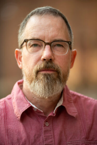
Headshot taken by Dan Marshall. All other photographs in this article were taken and provided by Todd Thyberg.

TODD THYBERG of Angel Bomb comes to us from Minneapolis, Minnesota. As a regular customer of Boxcar Press for the past 20 years, Todd’s focus has shifted to his impressive handmade books, pressed with our photopolymer plates. They are featured in over 100 private collections, libraries, and universities. Utilizing the world around him, Todd draws inspiration from all over, from the the town in which he prints to his voyages all the way down to Antarctica. We invited Todd to share his story with us.

SMALL BEGINNINGS, BIG CITY — I come from a small town in North Dakota and moved to Minneapolis in my 20s to attend the University of Minnesota, where I majored in graphic design along with taking creative writing classes. I’ve made Minneapolis my home because it has such a supportive arts community. I love living in a city that’s big enough to offer a wide array of diverse cultural activities without being too large and chaotic.

I founded Angel Bomb in 1997 as a graphic design studio. I added letterpress capabilities in 2006, and have evolved my business from producing client work to creating fine arts books full-time. My work spans social justice topics, science fiction, experiential reads, and horror, etc.

Whenever I start a new book project, I fully immerse myself in the subject matter. For example, in order to gain first-hand experience and knowledge about climate change’s devastating effects on the polar ice caps, I took on the persona of a polar explorer from days of yore. I’ve sailed on board tall ships in both polar regions, with my most recent adventure sailing from Argentina to Antarctica – crossing the treacherous Drake Passage en route – for book research. When I seek out challenges like these, it’s how a lot of my book ideas flow.
SMALL PRESS, BIG IMPACT — As a graphic designer, I’ve always loved letterpress and was drawn to the handcrafted, tactile nature of it. Luckily, there was a lot of it happening in Minneapolis. Little did I know you could buy a press, learn how to use it, and put it to work.

I received a tiny Kelsey tabletop press as a gift and it was too small to be anything more than a novelty, so I found a larger Chandler and Price on Ebay and drove to Indianapolis to pick it up. Then I hired some local letterpress printers to educate me. (Shout out to Allison Price and Monica Edwards Larson for my initial tutelage!)

I printed for myself until I felt confident enough to offer it to my clients at Angel Bomb. Within a few years I was printing more than I was designing and thoroughly enjoyed the physicality of it, especially being able to bring my designs to fruition from concept to printed piece.

Seeing one of my designs – or one that a client had brought to me – come to life on press through color and impression is deeply satisfying. At the end of a print run, here you have a stack of beautiful work that will go out into the world and get passed from person to person, hopefully with a little awe or delight on the recipient’s part. That’s a wonderful thing to think about.

What was your very first press? The silly Kelsey 3×5″. Just a toy, really. I used it once to print my name and then bought the 8×10″ Chandler and Price.

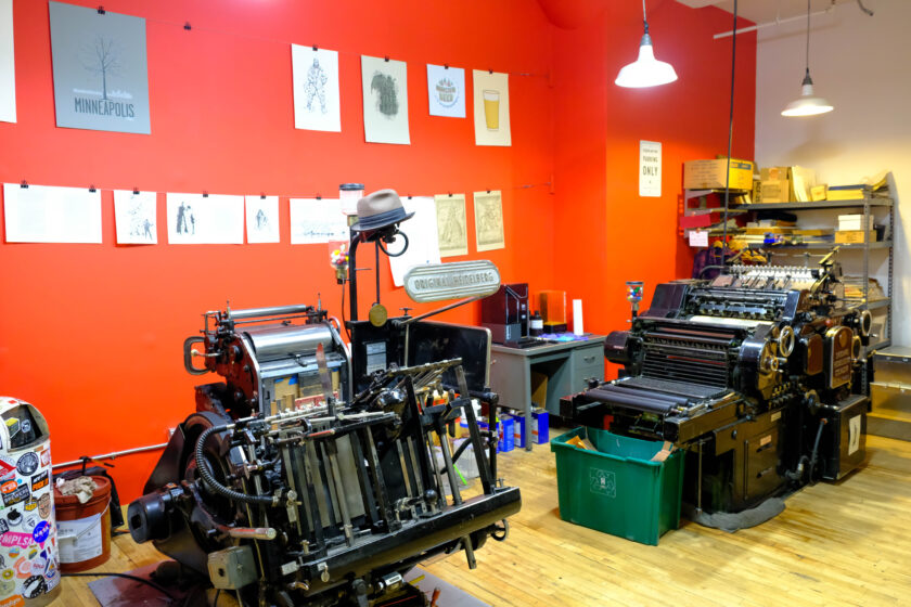
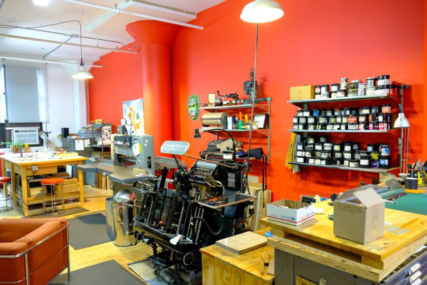
For years I was always looking for presses that would print larger, faster, better, etc. so I’ve had nine presses over the years: C&Ps, Miehles, Vandercooks, and Heidelbergs. Once I became proficient on my first Windmill, I was sold on Heidelbergs and the ease of registration and consistency with them. I love being able to print and diecut, and now I have a Windmill dedicated to each purpose.
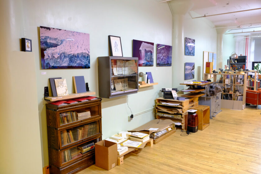
COMFORT & COMMUNITY — Angel Bomb has changed a lot over the years but my studio remains a creative and inspiring place. I like to keep it comfortable and cozy, and I change the layout periodically to reinvigorate the space. Could be a fresh coat of paint on the walls, a reading nook bordered by bookshelves, or rearranging what’s on display.

I’m located in a large building full of artists, which is great because I mostly work by myself so it’s nice to have people around. We’re a pretty good community when it comes to helping each other out. I love helping other artists by cutting their paper down or lending them a tool, and if I need some woodwork or metalwork done I know someone who can help.

What’s nearby? My studio is in the Northrup King Building, a 109 year-old former seed processing plant in the center of Minneapolis’ Arts District. I’ve been here for 20 years and it’s a cool historic building with lots of weird, hidden spots that people aren’t supposed to wander around in. I’ve actually filmed a couple of spooky introduction videos for some of my books here – with permission, of course – and the setting was perfect.

The local restaurant and craft beer scene in Northeast Minneapolis, where the Arts District is located, is fantastic and well known throughout the metro. Lots of great options can be found in the smaller neighborhoods throughout “Nordeast,” which makes it easy to entertain guests from out of town. There are several restaurants that’ve made the New York Times’ best in the country lists in recent years such as Oro by Nixta, Vinai, and Diane’s Place. My all-time favorite and somewhere I eat regularly is a local Mexican restaurant called Maya. Highly recommend.

And of course, being in a city with a Book Arts Center is tremendous. I’m so glad that the Minnesota Center for Book Arts (MCBA) and the community they promote is here. Without it, I don’t think I could have successfully traversed this path that I’m on.

MENTORS & SHOUT-OUTS — I’m big fans of Allison and Monica and another local, Kent Aldrich, who runs Nomadic Press. Most letterpress people in the Twin Cities have been willing to help out and be a good neighbor, which is great if you’re in a jam. I’ve enjoyed doing the same for others.
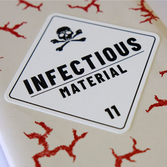
FULL-TIME BOOK-BIND — Once I added letterpress to Angel Bomb, I loved it and had a great run up until COVID. I would make plates and print most days of the week. I’d print a book every other year and worked with hundreds of clients printing business cards, wedding and event invitations, coasters, and brand packaging. The tactile nature of letterpress and the use of quality paper is important to me.

When the pandemic slowed everything down, I decided to focus on my book arts. I still take care of existing clients and welcome new ones who share the same values, but I’m much less of a job shop now and instead put my energy into my book projects. Books take quite some time to design and produce, so I’m not on press as much as I’d like.

OPEN MIND AND FINE DESIGN — Oh yes, that’s what I trained for! I’ve always been a fan of working with words, so my design processes usually start with free association. What does this project want to be, how should it be received, what should it look and feel like? I always strive to create something that people want to hold onto, to pin up on their bulletin board because it’s cool or unique. This all starts with language and from that, I start to sketch and determine how best to visually represent the ideas I’ve jotted down to turn words into effective visual designs.

I like to look at historical references for inspiration. My design has always been bold and graphic, so early 20th-century propaganda and art from the Works Progress Administration (WPA) are right up my alley. This was a time when artists were hired for commercial work, and it really shows in advertisements that burst with beauty and dynamism that still hold up even today.
ASTOUNDING ACCOMPLISHMENTS Back in 2012 I received my first grant, a Jerome Book Arts grant through the MN Center for Book Arts. I was thoroughly excited! Here was an organization that felt the idea I had for my first book was worth supporting with an exhibition and financial backing. It was an amazing experience and so affirming. The result of this grant was The Airship.

My second book was also supported through a grant from the State Arts Board two years later and that showed me that I was on to something. I didn’t get a lot of support when pursuing my artistic potential growing up so getting grants from organizations and recognition for my work really validated that I was heading in the right direction.

I continued making books and in 2023 won a McKnight Book Arts Fellowship, which literally brought tears to my eyes. I’ve long sought recognition and affirmation of my book art and am extremely proud of achieving this milestone. McKnight made it possible for me to travel to Antarctica and further my education at book arts institutions.

Lastly, my work appears in over 100 private, library, and university special collections and museums across the U.S. and Canada. I’ve been fortunate to foster meaningful connections with people I’ve met at places like the annual Manhattan Book Fair and biannual Necronomicon in Providence, RI, which has led to multiple purchases from my book art catalogue.

HISTORY WITH BOXCAR — I’ve been working with Boxcar since I started printing, so for 20 years! I did have my own platemaker when I was printing a lot, but Boxcar still helped with troubleshooting and negatives. Since I sold the platemaker, I now order my photopolymer plates from Boxcar and know that they’ll be properly exposed and shipped straight to me in a timely manner.

A TIP FROM AN ANGEL — One trick I learned from a pressman I’d used years ago – an old guy with only one good eye – was to push the job towards the top of the page to allow the crop marks to run slightly off the top of the page. This is useful to be able to see any shifting in the print from subtle differences in feeding. It’s a great help with registering the opposite side too, allowing you to see both impressions and adjust the guide to pull them together.

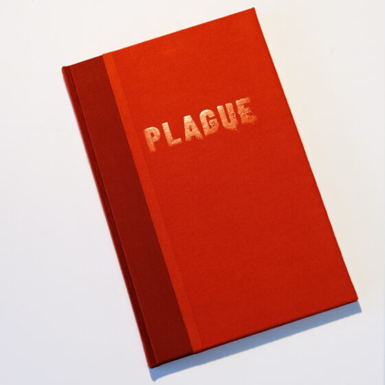
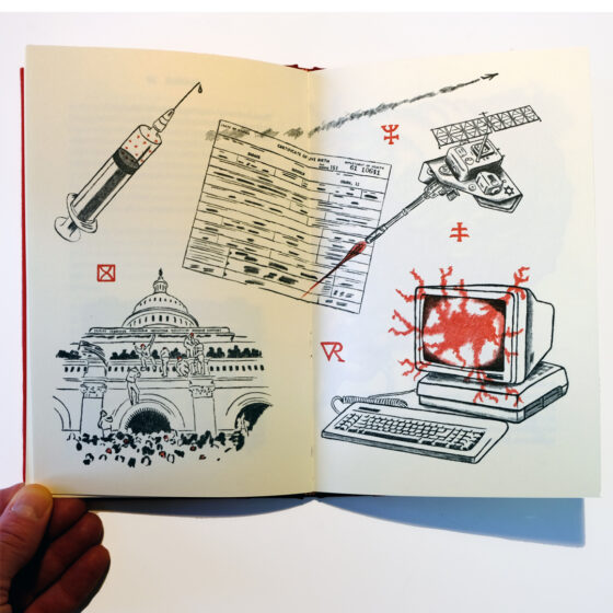
WHAT THE FUTURE HOLDS — I just finished a difficult book, Plague, and am now trying to work on something a little lighter and less stressful. Plague is a story I started last year when the current administration weaponized their assault against immigrant and LGBTQ+ communities. I was profoundly offended and angered that I needed to manifest something from these feelings.

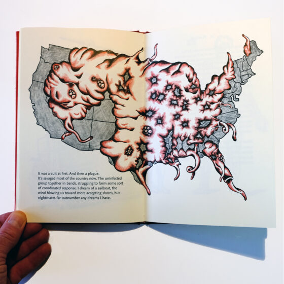
Plague is a timely zombie-apocalypse story using political allegory to examine the rise of extremism in contemporary America. The narrator and his small band of survivors, including a gay couple targeted for who they are, hide from the violent “infected” horde who have succumbed to a plague of fear-mongering, propaganda, and rage.

It’s the most personal work I’ve created, and I feel the voice of the narrator is my own. The “hunted” in the story are characters based on my close friends.

When ICE came to Minneapolis and murdered Renee Good and Alex Pretti, real life outpaced my fiction, and I felt a strong need to record what was going on in my art and put it out there.

WHAT NEXT – Sooooo… right now I’m illustrating an edition of The Raven by Edgar Allen Poe, which will have a unique twist to it, and I’m also working on books based on my voyage to Antarctica.

A big thank you to Todd for sharing his book and print passion. We look forward to seeing what cool new opportunities come his way.

File Prep Tips: Canva and Procreate

We love hearing about all the new and popular creative programs & apps out there. From Canva to Procreate…  we’ve got you covered in terms of how to set-up a digital file. Our hope is that by sharing some tips & tricks, the process is as headache-free as possible.

Boxcar’s Note: All of the above programs are pretty good, however, they do not get you all the way to what we need for a plate ready file. 

You’ll need to email us your pdf so that we can fix them up for the “last mile” leg. 

Reach out to us at info@boxcarpress.com.  We’re here to help!

The Short & Sweet:

  • All artwork should be 100% the size you need.
  • Send your art exactly as how you want your pulled print to look. 
  • Avoid wispy / fragile text or art.   If you think it may be too thin….then it probably is. You’ll it need to beef it up or scale-up the artwork (to be on the safe side).
  • Crop marks – include them inside and on the artboard if you need them for your own printing needs.
  • Artwork should be pure black or pure white (to the best of your ability).
  • Save out as a PDF.

File formats we do not accept: 

  • PNG
  • JPG
  • GIF
  • PSD

(If this is the only file format you have, reach out and we will assist or advise how to proceed to a plate-ready file.)

Canva tips:

How to Make a New Custom-sized Document

  • Log into or Launch the Canva program.
  • On the upper right hand corner, click the “Create a Design” button 
  • A fly-out menu will appear.
  • At the very bottom of the menu, click the text option “Custom Size”.
  • A new fly-out menu will appear
  • Change the measurements to inches
  • Enter in your Width and Height dimension in the correct fields. (e.g 5 x 7 inches)
  • Click OK.

Saving Out A Digital File

  • In the upper right corner, click the “Share” Button.
  • Next, click the “Download” button.
  • A new menu will appear.
  • Change the File Type to “PDF Print”.
  • Change the Color Profile to CMYK (may need to purchase a subscription for this).
    • DO NOT check the box next to “Flatten”. This will make a low-quality file (no fun).
  • Click the “Download” Button
  • A new pop-up window will appear. Save to your local computer / desktop.

Procreate tips:

Saving Out As a Digital File:

  • Tap “Actions” 
  • A fly-out menu will appear. Under the Share Images section, tap the word “PDF”.
  • Choose “Best” if prompted (this refers to the quality of the file).
  • Save to your local drive on your iPad


Trust Boxcar Press with your files, whatever your program. Send us a PDF file with what you have and we’ll work our prepress magic to aid you.

Podcasts And Interesting Letterpress Finds For Listening And Viewing

What is playing in your earbuds right now?  What keeps you engaged and entertained while you work, walk the dog, or drive in the car?

If podcasts are “your thing”, we know there are over a half million active podcasts to keep you engaged and entertained and learning. Have you given printing-related podcasts a chance?  This article is all about content that speaks to your love and interest in letterpress, book arts and printing. It isn’t complete because there are new channels all the time but here is the start of a fascinating ride down the letterpress road.

Podcasts offer an international perspective on every topic. They showcase artists and personalities worldwide. This list is no exception. You’ll meet some hosts that you’ll connect with and it will be like hanging out with friends.  It is very likely some of the interviews are with people you have met.

Come check these out:

Apple Podcasts
These have great stories of printers, scholars, artists and craftspeople.

Soundcloud podcasts –

Spotify podcasts
Search for these podcasts for letterpress individual stories.
Letterpress is often a topic that is a focus of podcasts with a much broader focus.  Here are some episodes that are letterpress specific –

Miscellaneous –

IBOOKBINDING.com  ( based out of the UK)-
There is an international flair to this website where you can hear podcasts, live streams and interviews. Topics include bookbinding in Scotland, Mexico, Northeast Africa, Finland and Greece. There is interesting book binding discussion like Medieval book binding and a Bookfair in Holland

The live streams include unusual book shops all over the world, and slightly fun off the wall topics like Human Skin bindings.  There are visits to Russia and Paris and Belgium. It’s also nice to have a breakdown of the broadcast by key moments with minute markers to lead you to specific topics discussed. If you like a little video streaming too, they have videos by Facebook and YouTube

Books in the Wild (a podcast with a fun name)-
This podcast investigates the hidden stories behind books and printed matter. Instead of reviewing books solely on their written content, they try to offer varying perspectives on everything from conception to creation to reception. This is a podcast about book arts: letterpress printing, bookbinding, artists’ books, small press and independent publishing, and stories from book history.

The Truth in This Art – Allison Tipton: Shaping Baltimore’s Artistic Landscape Through Letterpress

The Romance of Letterpress with James Cryer – A grandfather’s handwritten journal chronicling printing in the early 1900’s.

Last Click: Bonus Videos –
If you are streaming with a tablet or computer and want a little video – here are a few bonus videos. Lots of ways to gain new letterpress info, instruction, and entertainment in these videos. So get your taste with these few here.

  • Stukenborg Press on Youtube
  • Skillshare.com (There is a fee for these). Topics include Operation and Maintenance of Heidelberg Platen, Getting Started with Letterpress and Instruction on Designing for Letterpress with Adobe Creative Suite Products.

Let us know what jewels you have found in your podcasting by sharing!

Letterpress Treats: Sweet Bippy Press

When Michael first met Patricia, she saw his printing press and said, “I’ve always wanted to have a greeting card company.” That’s all it took. Three years later, the duo has over 200 card designs via Sweet Bippy Press; a 1,000-square-foot shop, and is having more fun than adults should be allowed to have.

As co-owners, Michael and Patricia love coming up with ideas for new cards. For the last 30 years, the pair has been honing their skills—Michael in national consumer advertising and Patricia in sales and customer success. It’s a perfect match (the title of one of their card designs, coincidentally). Michael sat down with us to talk shop, vintage guitars, and a beloved press called “Vanderhalen”.

INK IN THE BLOOD “In 2002, I went on a press check at Full Circle Press in Nevada City. The owner, Judith Berliner, convinced me to buy my first press, a Chandler and Price. From the time I pulled my first print, I was hooked. Over the next couple of years, Judith went on to train me on her Windmills. She’s truly an angel”, said Michael.

PRINTING PARADISE We have an industrial space in an amazing warehouse in Petaluma, California. It’s called Watershed, and it’s a wonderfully creative building filled with fine artists, photographers, and woodworkers. We feel lucky and blessed to be here. The shop has a pretty minimalist decor. We painted the back wall PMS 137 to give it some energy. We are right on the Petaluma River. You’ll likely spot some competitive rowers, along with the resident egrets and Great blue herons.

ALL IN THE NEIGHBORHOOD Just down the block is an amazing artist, Marco Cochrane, who makes three-story-tall sculptures out of metal. We also face Petaluma River Park with a sculpture by Mark Di Suvero.

PRINTING MENTORS Judith Berliner of Full Circle Press. She’s taught me everything. Sometimes her methods are not “by the book,” but they often work better. We have fun trading printing tips.

THE CREATIVE SPIRIT “Beginning in 2023”, Michael says, “I’ve been printing full time and loving every minute of it. I approach design from my advertising experience. Then, I start with a pencil and paper (Blackwings are my weapon of choice). I find it helpful to get ideas from my brain to the page quickly. The winning sketch gets redrawn (often in Illustrator) and finally, good old polymer plates. I sometimes dream about having cabinets full of type, but I just don’t have the room.”

PRINTING FEATS I’m proud of our “Famous Guitar” series of greeting cards. Each features a different guitar from some of my favorite musicians. There’s Willie’s old Martin “Trigger,” George Harrison’s “Rocky” Stratocaster, and a bunch more. They are unique in that they are scored on the short side so that you can open them up and see the entire instrument. They also come with a custom Sweet Bippy pick.

PRESS HISTORY Our first press was a 1905 Chandler & Price platen press.

In addition to the C&P, we own three Heidelberg Windmills, two for ink printing and one—named “Metallica”—which is dedicated to foiling and die-cutting. Our latest purchase is a Vandercook No. 4, which we call “Vanderhalen”, says Michael.

BOXCAR’S ROLE Michael recalls, “When I started out, I didn’t have much of a printing network, and I was craving information. Boxcar’s site is chock full of great tips and information. I was an early adopter of Flurry paper—I think you offered it as a Kickstarter at the beginning. I love that paper. And the Swing Away Lay Gauge is amazing. All three Windmills have one. (Currently, one of them is hiding in the dark cavity below, but I will rescue it one of these days.)”

PRINTING TIPS 90% of printing issues are ink-related, so start light and add slowly!

WHAT’S COMING NEXT We keep adding to our Northern California collection of cards, and this year we plan to expand to SoCal and perhaps other states.

Letterpress QSL Cards Around The World

I’ve had a fifty-year obsession with QSL cards. And a newfound interest in letterpress. This is the tale of how they cross paths.

Dad had a cigar box full of these nifty “ham radio postcards” (aka QSL cards) from when he first got his license in the 1930’s back in Nova Scotia. Amateur radio operators, or “hams,” send QSL’s to one another to commemorate a contact they’ve made over the air.

Going after distant signals has always fascinated me. As a kid in 1960s Prescott, Ontario, I’d love to tune the TV dial, seeking out stations that were only there on certain days. Why did that happen?

As a young teen, I got bitten by the shortwave listening bug, especially after learning that shortwave broadcast stations sent their own QSL cards! Back in the 70’s, the Cold War was in full swing and the international broadcasters both East and West loved to hear from their listeners.

Shortwave broadcast stations (you’ve heard of the Voice of America, the BBC World Service, Radio Moscow, etc.) made for an effective way to hear varying points of view. They also were a wonderful source of exotic targets for a teen to go after. I wrote to every single station that I could hear and requested their QSL card. I would send them a reception report, telling them exactly when I heard them, on what frequency, and what was heard in their programming.

Many—even most—of these powerful international broadcasters have since left the air. Amateur radio is a little different from shortwave broadcasting. While both types of radio are found on shortwave, ham operators are not broadcast stations trying to reach a wide audience. Rather, they are individuals contacting other individuals.

In 1980, I got my Canadian amateur radio license and drew-up my very own QSL card. It featured one of my boyhood hang-outs, the lighthouse just two miles down the St. Lawrence River. (Look up the Battle of the Windmill near Prescott, Ontario if you like history.) I had the cards printed at a local print shop in Brockville.

Well, my love of shortwave listening and ham radio eventually turned into a 27-year career in radio broadcasting. At one point, that included six wonderful years as an international broadcaster at my favorite shortwave station, the “Voice of the Andes-HCJB,” in Quito, Ecuador. In fact, my wife, Lisa, and I were hosts of a program especially targeted towards shortwave hobbyists. We started raising our family in that beautiful Andean capital. Back in Ontario, Dad and Mom tuned in and listened to us each week, along with listeners around the globe.

Our family returned home in the mid 90’s and I continued broadcasting from Syracuse, NY. Eventually, I left radio to get into elementary teaching and audiobook narration. The teaching never got beyond subbing, while the narrating is something I still do on occasion. Two years ago, a steady position as a platemaker at Boxcar opened up. Letterpress was a different world to me—life on Jupiter might have been more familiar—but they were willing to teach and steady work was very attractive!

At Boxcar, Cathy Smith encourages all of us to use our department’s Vandercook Universal 1 for projects of our own. It’s an excellent way to learn and appreciate the printing side of letterpress. I’d done a few of these projects. However, I could never draw and ideas relating to visual artwork didn’t come easily to this audio-entrenched mind.

In the fall of 2022, I found myself re-bitten by the ham radio bug. However, if I wanted to receive QSL cards, I’d have to send QSL cards. By this time, though, I had an idea for a QSL, thanks to the hundreds of wedding invitation plates I had made over the past year. A map! I loved maps!

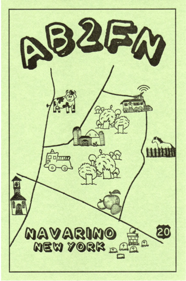
First, I sketched out a map of the roads around the hamlet of Navarino, our New York home since 1999. Next, I asked my daughter, Rachel (who also works at Boxcar) if she’d be willing to make some of her cute drawings for me for the map. Rachel was only too happy to give it a go and I was delighted with what she came up with.

At Boxcar, Rebecca put Rachel’s drawings onto my map and formatted the finished work for the negative. A second negative was made with the technical information on the QSL’s backside. I used a KF95 plate to make the first run of AB2FN QSL’s on green paper stock.

By the spring of 2023, I had sent all of these QSL’s to other hams and needed a new batch. This time, I wanted to try two colors on a lighter-color stock. Cathy had some 80 lb weight ivory stock with a felt surface. I went with an earthy brown and hunter green for the rural theme. We made a few small changes to the artwork (that’s Rebecca’s portrait of my head floating over the house). This batch went quickly and, with Cathy’s help, I found some more of the same paper on clearance and made a second run. This time, I used a KF95 plate for most of the card, but a KF152 for the”AB2FN” to give my call letters more of an impression. Our Universal 1 has an adjustable bed.

By August, it was time for yet a new supply. As southern Onondaga County is known for its apple orchards, I thought that an apple-themed border would work well. Rebecca brought this together and we went with red.

In the year since I began making QSL’s, I’ve sent out about 150 cards to hams in over 100 countries, including Australia, Andorra, Thailand, China, Scotland and Oman. While many hams use computer programs and printers to fill these out today, I really enjoy doing it by hand. It’s the feel of the pen contacting the paper, each time trying to improve my penmanship. For much the same tactile reason, I enjoy using an old-fashioned Morse code key to make most of my contacts, although I’ll use the microphone if there’s an exotic station I really want to contact.

And, to be honest, as a broadcaster at heart, I do like the feel of using my voice. A surprise was discovering that QSL cards and letterpress are a link shared by a number of hams! Ham radio and letterpress—especially the printing stage—have a similarity in that both arts require plenty of fussiness and fine-tuning. Besides a bond with past traditions, there is also the bond between an operator and his or her equipment, and the care in repairing and maintaining what is often older technology. Here’s a link to another blog by a fellow ham operator, QSL collector and letterpress printer. He designs his cards to match the early style used in the 1920’s and 30’s.

Not long ago, I was corresponding with a fellow whose ham-related small business dried up, partially on account of many hams today preferring “electronic QSL’s”  over paper. The “QSL” is a jpeg sent over the internet.

Bleah!

As we lamented the loss of the old ways, I mentioned that I was so “old school” that I made my own paper QSLs on a letterpress. “OMG!” He replied, and then went on to tell me how his father had a printing business and taught him to handset type at age five. He eventually used his dad’s 10 X 15 C&P and a 9X12 Little Giant for his own at-home letterpress business, which included QSL’s!

Making my own QSL cards has given me a much deeper appreciation for the talented and dedicated artists at every stage in every department at Boxcar.

I still have Dad’s QSL’s—even the cigar box!

City Series: Magnificent Miami

For this edition of our City Series, from the tides & (wooden) type to the colorful scenes of beaches and Everglades, the Extra Virgin Press owner shares his multicultural community of Miami, Florida. The people and the history continually inspire Tom Virgin in his printing as he works to grow letterpress and the Book Arts, particularly with kids. He was gracious to give the inside scoop on favorite creative places and eclectic hang-outs in the city that brings the heat. 

HOME SWEET HOME This is kind of a tricky question. I spent my first two childhoods (decades) in the suburbs of Detroit. After two years in college, I dropped out, traveled the West with friends, and rejoined my family when they moved to South Florida. I lived in Boca Raton, Florida for the next two childhoods, eventually earning a BFA in Printmaking and a Florida teaching certificate, one or two classes at a time. I also worked as a gardener in the family business.

(All photography courtesy of Tom Virgin unless otherwise notated.)

In 1992 I moved to Miami, on the heels of Hurricane Andrew, to begin an MFA in Printmaking at the University of Miami. Remarkably, I found a tiny apartment in Coconut Grove. It turns out that finding a place to live in a disaster area is easier than I thought. I have lived in Coconut Grove ever since, moving to West Grove for the last ten years.

NEVER THE SAME DAY TWICE Miami is like going around the world on any given day. Almost thirty years of teaching in Title I Public Schools introduced me to the children of all the cultures that make up our city. They were generous to this gringo who grew up in the Midwest. I wake up each day in West Coconut Grove, the original historic Bahamian settlement that became the Black Grove. Think peacocks, huge Banyan and Tropical Almond trees, and a short walk to Biscayne Bay. My pre-WW2 apartment is around the corner and down the street from the Coconut Grove Playhouse, built in the 1920’s. This part of the Grove has many humble and historic Shotgun homes and is one of the oldest parts of the city.

(Top: miamidadearts.org; bottom: coconutgrove.com)

Most days I drive twenty minutes north on I-95 through Downtown to Little Haiti. This was one of the original bedroom communities of the city. Much of the population is made up of Haitian immigrants. I am four blocks west of Little Haiti Cultural Center, Sweat Records, Laundromat Art Space and Carl Juste’s IPC Art Space. The City of Miami named a street after Carl’s parents, who were remarkable community builders and early immigrants to Miami from Haiti.

(Top: Little Haiti Cultural Center; middle: Laundromat Art Space: bottom left: IPC Art Space; bottom right: Sweat Records)

In the same neighborhood two blocks away is what used to be the Cuban Embassy pre-Castro. My shop is in a building (that used to be a grocery store) with Emerson Dorsch Gallery and Exile Books. Across the street is a lovely cafe named Sur. The family that runs it comes from Buenos Aires… Pastries, empanadas, sandwiches and family love daily. Did I mention the Mango Mint Lemonade? On either side of me are Panther Coffee and Clives Cafe, from Brazil and Jamaica respectively. Family is key around here. In the local Haitian grocery, you can buy Haitian peanut butter that includes scotch bonnet peppers as an ingredient. It was an epiphany for me.

(Top: Emerson Dorsch Gallery; bottom left: Panther Coffee; bottom right: Exile Books)

BEAUTIFUL BEGINNINGS Since there are only two letterpress shops (that I know of) in Miami, and no strictly letterpress programs in any of the colleges or universities here, we can only work to raise more printers. Both Extra Virgin Press and my neighbors, IS Projects/Nocturnal Press, teach these lost skills in Miami .

(Credit: IS Projects)

My love of letterpress came from the many communities that have established printing and book arts cultures. I was in artists residencies each summer between school years for almost twenty years. NYC, San Francisco, the Twin Cities, Portland, and also a few National Parks.

We are printing and making a difference.

BOOK & PRINT CONNECTIONS A few months ago, Tropic Bound Book Fair debuted in Miami’s posh Design District. We are hoping that it will run in years opposite Codex as a biennial event. This fine press event brought many of my friends and teachers from around the US, to my neighborhood. The Fair organizers even brought a group to my little shop for a tour. Tropic Bound’s catalog for the show is coming out soon with all the participants. Hopefully, Boxcar Press will be here in February 2025. The event was supported by a Knight Foundation grant and organized by Ingrid Schindall of IS Projects, Cristina Favretto Director of the University of Miami Special Collections Library, and arts professional Sarah Michelle Rupert.

(Credit: O Miami Poetry Festival)

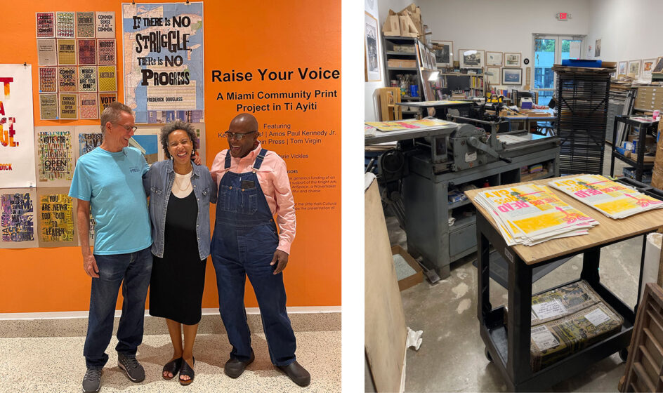
The O, Miami Poetry Festival has been bringing poetry to virtually everyone in Miami for over a decade. I have always worked to funnel some of that exquisite magic into my classrooms. Now that I am out of the classroom, they have welcomed me to their programs as an artist who works for kids. The most rewarding job I have ever taken on is making letterpress illustrations from one-word prompts, using wood type to “draw,” to accompany elementary school students’ poetry on postcards, mailed to the entire zip code of the elementary school that was home to the student poets.

This year we are planning to teach book arts to kids, to contain that poetry, and to disperse it into Miami. The poem on the roof of a parking lot submitted by artist/ designer Randy Burman is in the flight path of the Miami International Airport. It is memorable. Check out this video because, yes, a kid wrote that.

ONLY IN DADE (COUNTY) Miami has everything, everywhere, all the time, all at once…Always! However, there is not enough letterpress, yet. We are doing our best to make that Miami look. The whole world lives in this one city. For references go to @onlyindade. You will be shocked, delighted, and amazed. You may never drive in Miami again (hahaha).

ARTISTIC COMMUNITY SHOUT OUTS Miami is just beginning to develop a books arts/ letterpress community. Paper from Announcement Converters and French Paper has lifted my practice. Shell Lumber in the Grove has the best art supplies that a printer could ask for.

HISTORY MEETS PRESENT After 1513, when Florida was “discovered,” the native Tequesta Indians of the Calusa Nation carried on much as they did for thousands of years, according to recent discoveries by the mouth of the Miami River. Roughly three hundred years later Key Biscayne and Florida became a US territory. The Key Biscayne Lighthouse was built in 1825.

(Bottom credit: Key Biscayne Park)

The causeway from the mainland to Key Biscayne was finished in 1947. When my friends from other places come to visit, I always take them to Bill Baggs Cape Florida State Park to see what Old Florida really looked like.  The State Park faces the ocean on the East, Stiltsville to the South, and Coconut Grove on the West.

(credit: Bill Baggs State Park)

The ocean is full of life, Stiltsville is a historic part of another National Park- homes on stilts in the Bay that used to sell liquor during prohibition and allowed gambling, and Coconut Grove on the bay is for the rich, historically or otherwise.

EAT, DRINK, BE MERRY I would be remiss if I did not mention Harry’s in Coconut Grove. Harry was my student. His dad, of Michael’s Genuine fame, has several excellent restaurants in the city. I am now putting Harry through college one pizza at a time.

(Left: Harry’s Pizzeria ; right: Garcia’s Seafood)

Garcia’s Seafood on the Miami River just west of Downtown is a family restaurant with excellent views of a working river, Miami’s culture, and the sounds of a city 24/7.

IN THE NEIGHBORHOOD Books and Books has been a cultural icon and gathering place for almost forty years. Mitchell Kaplan‘s regularly scheduled readings by locals and international authors plus the outdoor patio restaurant with a banned books mural keeps me coming back. Poets are a printer’s best friends.

(Credit: Miami Critical Mass bike ride)

Everything in Miami is a cultural attraction. However, on the last Friday of every month, Miami’s Critical Mass Bike Ride often travels through several of the less affluent neighborhoods. The cheering kids, smells of food cooking, variety of musical joy, and direct exposure to our varied population give me hope that we can all unite over shared changes in this city that include everyone.

EVOLVING CITYSCAPE There is rampant gentrification in Miami, especially in Little Haiti and West Coconut Grove. This threatens the places that I love the most, and many of the people, especially teachers. I have made three books and several prints since 2005 that reference these ongoing changes.

NOT TO BE MISSED Our Sunday Tai Class has recently moved south to Larry and Penny Thompson Memorial Park and Campground. This gem in South Dade, just past Zoo Miami, looks like Boca Raton did when I moved there in 1974. Slash pines, Saw Palmetto, big sky, exposed oolitic limestone, and freshwater lakes. Under the trees overlooking the lake, we forget everything but Tai Chi… And alligators.

(Top: Larry and Penny Thompson Memorial Park; middle: Fairchild Tropical Botanical Gardens; bottom: Pinecrest Gardens)

LAST THING TO SAY Miami is so close to the United States, and will welcome you in whatever language you choose.

LETTERPRESS STUDIOS IN SOUTHERN FLORIDA

OTHER MUST-SEE STOPS & (BIG!) SHOUT-OUTS

Letterpress Cards For Laughs

One of the newcomers to our staff is Rachel. A cheery team-member who cuts our Flurry paper and ships our supply orders, she loves to send snail mail. Since she has joined us, she has her eye on letterpress cards that bring a laugh, Rachel shares with us her round-up of humor-filled prints to make anyone’s day. Let us know which one is tickling your funny bone in the comments below!

funny-1

1. OK self care card by Sapling Press  | 2. Moving Away Card See Ya Later Alligator card by dodelinedesign  | 3. Letterpress Father’s Day card by StackCreates | 4. Domestic Adventures by HappyFinchStudios  |  5. Option To Sit card by Sapling Press

funny-2

 6. Beam me up, Scottie – Star Trek card by Letterpress Jess  | 7.  Vesties greeting card by PikeStreetPress |  8. Laugh Crass Calligraphy Letterpress  greeting card by Letterpress Jess

funny-3

9. Math Problems card by Sapling Press | 10.  Born To Be Mild card by McBitterson’s  | 11. How About Never? Seriously? card by Hazel and Violet  | 12. Stamp-worthy card by 12AcreStudio |  13.  Carbs card by Sapling Press

The Many Printing Dimensions of M.C. Pressure

Bright pops of color, clean designs, and a hearty dose of whimsical humor can be seen in the letterpress works of Ryan Tempro (and team!) at M.C. Pressure. The Florida-based printer sat down with us to talk shop about Kelsey tabletop beginnings and expanding out with new presses & custom-printed works in tow. Read on to hear about the satisfying pride that goes into seeing the printed pieces being transformed into one-of-kind crafted pieces.

Ryan Tempro - M.C. Pressure letterpress print shop, Florida.

PRINTING IN THE SUNSHINE STATE M.C. Pressure is a print shop in St. Augustine, Florida specializing in letterpress, foil stamping, die-cutting and embossing. I started the company in 2014 after printing a couple years at a small stationery shop while I was in college. We have a lot of capabilities for a small shop. It’s been exciting to see the clients we’ve been able to work with and the creative things they come up with! We also design and create our own line of products that range from greeting cards to coasters to notepads and more.

INK IN THE BLOOD I first learned about letterpress and what it was while going through the graphic design department at Flagler College, here in St. Augustine, Florida. I was able to get a job at a local stationery shop operating their 8×12 Chandler and Price. I fell in love with the tactility of letterpress and being able to create something with my hands and away from the computer.

Ryan Tempro - M.C. Pressure letterpress print shop, Florida.

After I graduated from college I spent a summer in New York for an internship with an artist and was exposed to a lot of different print and production methods. When I returned I started a job at a screen printing shop that had an old Kluge for die-cutting decals. My boss saw my interest in the machine and introduced me to a friend of his who was an old timer in town who ran letterpresses for years.

He had a few small tabletop Kelsey presses that needed some work, but had all the parts! I bought them and cleaned them up and started a little shop on the side when I had time and clients. Over the next few years, I grew from a little tabletop press to several larger presses and a full time shop for myself and a couple of employees!

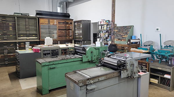
PRINTSHOP PARADISE Our shop is a modest 1300-ish sq/ft warehouse. We have a 30″ Challenge Paper cutter, an Orbital 8 Poly Plate Maker, 2 Heidelberg Windmills 10×15, 1 Heidelberg GTP 13×18, and 1 Heidelberg KSBA Cylinder Press. I love the capabilities we can accomplish with these machines. They are incredible workhorses. Some days they can be very temperamental, but overall they are wonderful and I’m very fortunate to have the machines I do. My favorite is probably the KSBA, it’s such an accurate press in all aspects of register and inking. I’d be lying to say as a printer that I didn’t love to print large, and that press allows us to really work on a larger format.

Ryan Tempro - M.C. Pressure letterpress print shop, Florida.

Our shop is located in St. Augustine, Florida which is the nation’s oldest city. It’s also a pretty small area so the community as a whole has been very accepting and welcoming of us and our small business. St. Augustine has a lot of rich history and a lot of great local makers and restaurants… a lot of which we’ve become friends with over the years. It’s truly a great community to be in support of and help others follow their passions.

Ryan Tempro - M.C. Pressure letterpress print shop, Florida.

CHILL NEIGHBORHOOD We have a city guide online for sale with a lot of our favorite places. The downtown area is where a lot of people visit when they come into town, though it’s also filled with the most touristy things in town. We are off of the West King Neighborhood and we love it! I’d say if you’re in town check out the Blue Hen Cafe for breakfast or SunDay. Dos and The Kookaburra for coffee. Juniper Market for a snack. Really there are so many great spots in town!

PRINTING MENTORS The print community as a whole has been very helpful. I’d say our biggest contacts are Dan over at Clove St. Press. He is probably one of the best I’ve seen, and I have to include Matt at Matte Gold in Australia. They also have GTP Foil Windmills and were a huge help in learning more about that machine specifically. I always love seeing the content and machines running from Studio on Fire and their capabilities are truly incredible. We have a shoutout to Letterpress Mechanic and Chris at FI Letterpress as well for troubleshooting. Really, there are folks all over we keep in touch with and love to see work from.

Ryan Tempro - M.C. Pressure letterpress print shop, Florida.

FULL TIME FUN I started M.C. Pressure in 2014 and worked on it part-time until the beginning of 2017 when I went full-time with it! I can say that I honestly love my job and love what I do.

THE CREATIVE ENERGIES I went to school for graphic design so some things are still designed by me. At the moment though most of my time is spent on press and business admin tasks. We have an employee, Lauren, who focuses the most on graphics for us. She graduated from Flagler College as well. We use a lot of digital processes in the work-flow. We use the Apple iPad and Pencil for a lot of the illustration work and typically finish up type in the computer through the Adobe suite.

Ryan Tempro - M.C. Pressure letterpress print shop, Florida.

We usually think up a funny idea and work on visualizing it. Or we have an image we want to create and work to create a use for it. Sometimes we get feedback from customers on looking for a type of product or more of a certain type of thing and can work to make them. For example, more birthday cards, or something to say I like you, but maybe don’t love you quite yet.

Ryan Tempro - M.C. Pressure letterpress print shop, Florida.

PRINTING FEATS Hmm, I’m always really proud of the packaging projects we work on here. Seeing the printed pieces being cut down and transformed into a three-dimensional object is always so satisfying. Most recently we printed a pretty complex and accurate carton for Hellcats USA for their Devilish Scent. A black outer sleeve with matte red foil and a red tonal letterpress printed on red for the inner carton. It had a cutout that needed to line-up perfectly with the print inside, and assemble to be snug enough to hold itself together. Clark Orr worked on the dieline and he truly nailed it with this project!

Ryan Tempro - M.C. Pressure letterpress print shop, Florida.

PRESS HISTORY Our very first press was a 5×8 Kelsey Table Top. It was a great start, but thank goodness we don’t have to work on such a manual press anymore!

BOXCAR’S ROLE In the early days of us starting out, we used Boxcar Press for all things! We got a set of inks, letterpress base, printing plates, and would use their resources to help figure out how to use the machines we acquired over the years. Though we don’t use Boxcar Press much these days, they were a huge help in getting us started on projects and understanding the things we use.

LETTERPRESS TIPS It isn’t always possible, but I almost always print with crop marks. I know it makes for a larger plate and paper size AND requires trimming. However, It really saves so much time, I think, on press to be able to utilize the grid on the Boxcar Base. It also allows for what I think is easier spotting if things start to bounce or get out of register.

Ryan Tempro - M.C. Pressure letterpress print shop, Florida.

WHAT’S COMING NEXT Over the last couple of years we’ve acquired various pieces of machines. This year we hope to not do that as much and really focus on the things we have to be as streamlined and efficient as possible! We don’t have a dedicated retail space, but we are working on some ideas to change that and hopefully get things out there more in our community!

A double round of applause & thanks out to Ryan Tempro at M.C. Pressure for letting us take a sneak peek at his wonderful plus fun printing realm!

Creativity Blooms At Hazel & Violet Letterpress

Nancy Hill of Hazel & Violet Letterpress, is a fine press printer who calls Phoenix, Arizona home.  The colorful and inviting letterpress studio (which matches Nancy’s personality to a T) is also a teaching facility and commercial print shop with roots in the community. She was kind enough to give us a shop tour of her printing paradise.

Nancy-Hill-letterpress-workspace

AROUND THE SHOP Lighting…[we have] a bunch of LED flood high up on a 20′ wooden ceiling. The overall lighting is good, however, specific lighting (like to take photos) sucks. The floor plan changes annually but I think we have it right now. Production presses (Windmill, C&P) are in the back and the proof presses are in the front… type is everywhere. Decorating style: posters and prints on every square inch of wall space in no particular order. Floors are concrete.

PRIZED PRINTING POSSESSIONS Oh hell, I love it all. I love all my presses and most of my type… I also dearly love my big-ass working table… where I can spread out projects, work in progress, and new ideas.

SHOP SIZE The whole space is about 1500 sq. feet, but I sublet about 600 of it to an art collective for their gallery.

AROUND THE NEIGHBORHOOD The building is everything! It used to be Braggs Pie Factory (yes, they made pie exactly where we now print). It now houses a coffee shop, restaurant, beauty salon, head shop, art studio, a puppet shop…. and ME. Our neighborhood (downtown Phoenix-adjacent) is called Historic Grand Avenue…just an incredible neighborhood. The owner of my building is an artist and has completely decorated everything in front of the building and the entire street is amazing.

TYPE OF SHOP We are an open-to-the-public retail space, workshop space, and printing studio. We are open almost every day. We also have events on First and Third Friday nights for an art walk. We have a poster set up on one or two of the proof presses and anyone can come and print a free poster. The last First Friday we had a bit more than 200 people.

PRESS FAMILY

  • Heidelberg Windmill
  • C&P 10×15
  • Repress #1 Proof Press
  • Potter #2 proof Press
  • Long-master Showcard Press

MOST VALUABLE TOOL Probably the Windmill. We do wedding invites on this one. But the C&P is what we print all of our cards, stationery, and coasters on.

FAVORITE INK I use a variety of inks. If I need a specific PMS color I sometimes go with Southern Inks (good guys). But these days, my pressman mixes ink colors – which certainly saves money. My stay-open black ink (forms black )that I use ALL THE TIME I get locally at Quality Inks.

CLEANING SOLVENT OF CHOICE Speedy Wash from Kelly Paper. To clean up I use white random rags by the pound from Ace Hardware.

BASE SYSTEM & PLATE OF CHOICE Boxcar. Boxcar. Boxcar. Love you…Never use anyone else. I do occasionally use Owosso when the client wants a cut. I also went to an Industrial supply house to get an 11×17 tool plate aluminum base. (sorry)

FAVORITE OIL LUBRICANT Whatever. all-purpose stuff.

BEST CLEAN-UP RAGS Rags by the pound from Ace Hardware. Best deal.

PIED TYPE? Nope. I have a few old tied-up forms that people have given me over the years. Weird stuff from the 40s and 50s. Eventually, I’ll dump them in the hell box (can) and run them upstate to Sky for credit on some new type.

ORGANIZATION TIPS No secret…constant vigilance for stuff not in the right place. Also, I am the queen of spreadsheets… so, there is always a plan.

PRINTING ADVICE The old rules don’t apply.

Nancy-Hill-letterpress-workspace

Beyond the Classroom: Letterpress Adventure

Nothing makes us more proud and excited when we learn about young printers and poets in the schools getting a chance to put their hand to a press. The sixth grade students of Mount Desert Elementary School (Mount Desert Island, Maine) experienced the joys and challenges while printing their own poetry this past year. The project was led by writing teachers Ms. Mariah Baker and Ms. Maria Simpson combined with artists/printers Nikki Moser and Katherine Emery.  Read on to hear all about the group’s instruction in hand-set type, printing with photopolymer plates, bookbinding, and the fun that went into the Call of the Robin letterpress printed book project.

Mount-Desert-Maine-students-letterpress-classroom-on press

KATHERINE EMERY: I had met my daughter’s writing teacher, and she told me about a month-long poetry project the 6th graders were working on, and how it had transformed their attention and energy. It was a positive place to put their worries about the world. She was trying to do something special for them as an end-of-the-year project.

On impulse, I offered to help them print their poems. I got Nikki to agree to use her press and then persuaded the teachers to agree to bring the class for printing. I volunteered to help layout the poems for photopolymer plates, and then helped the students sew the books together. What a day when the kids walked to Nikki Moser’s artist studio and pulled prints on a tabletop press. After the students bound their final books, they signed their poems in the editions.

Mount-Desert-Maine-students-letterpress-classroom-on press

Teacher MS. MARIA SIMPSON:  After the “Call of the Robin” poetry book was completed, we read the poems to the 2nd graders and it was so moving – each kid read their poem with feeling and passed a printed book hand to hand.

Then the kids gave the second graders advice about writing their own poems. One student, Kohl, had this advice, “Sometimes, when I got stuck, I would take a little walk. Then I would come back and write from my heart.”

It was an inspiring project that the students and I will remember for a long time. I look forward to doing it again!

BTS Kim Namjoon eats tonkatsu and enjoys letterpress.

STUDENTS’ REACTIONS AND REFLECTIONS

PIERCE HOLLEY: This experience was super fun and I loved that we got to be writing and doing art at the same time! It was really cool to be doing the printing instead of just using our computer like we always do. This would be an amazing activity for others.

Mount-Desert-Maine-students-letterpress-classroom-on press

LANAIA McDANIELS: I really enjoyed the printing project. It was super fun to do, and I got to learn new and interesting things. The best part about it was learning how to use the printing press. It was fun to see and use it because I never knew about a printing press and the history behind it.

Mount-Desert-Maine-students-letterpress-classroom-on press

Kemy: I got to learn from Nikki and Katherine the basic skills behind printing and making my own book. It was very fun and I got to be with my friends trying new things.

Mount-Desert-Maine-students-letterpress-classroom-on press

HELAYNA SAVAGE: I loved writing poetry with Ms. Baker and Ms. Simpson. We did a lot of different types of poetry and close to the end we went to a place where we used a printing press. Best thanks to Katherine Emery and her work partner.

CORINNA JOHNSTON: I learned how printing is made and I really liked getting to print my own poem. 

PHOENIX SWEET: With Katherine and Nikki, I had fun learning to bind a book, I also enjoyed putting ink on, learning to use, and printing my poem on the printing press.

Mount-Desert-Maine-students-letterpress-classroom-on press

We’re proud to share their story and hear how printing enriched these students and inspired fellow printers to reach out to their community. Huge round of applause out to Katherine, Nikki, and both teachers for getting their students invigorated about being on press and creating a lasting project.  As Katherine beautifully stated about the project: “the 6th graders [were] over the moon to be out in the sunshine, celebrating words, and using beautiful old machinery to honor their inner voices.”