Crop Marks and Registration Marks – A Printer’s Tool

When prepping a file for platemaking (or any printing job), you may find yourself deciding between crop marks and registration marks. Not sure which one to use? We’ve put together some scenarios where you might find these tools helpful — but first, we’ll start with some definitions and distinctions between the two.

Crop Marks Or Trim Marks:

Crop marks — also called trim marks — thin lines placed at the corners of your artwork that indicate where to trim your finished project. If your paper is larger than your final cutting size, it is helpful and sometimes crucial to include them. Crop marks help the person cutting to know precisely where to cut your piece.

When might it be important to have paper that is larger than your final size rather than a pre-cut size? For presses that grip the paper, using a larger sheet and making a finish cut allows you the paper edge or space to grip and guide the paper while printing, and provides space for you to use a guide pin (which may leave a mark on the paper).

An example of crop marks on a film negative and printed via letterpress.

Crop marks become crucial if you are printing a bleed (which is a design that runs to the edge of the finished piece). A design with a bleed is one where the artwork extends a minimum of 1/8″ past the edge of the finished design. Extending your artwork past that point prevents a blank or unprinted area from showing up along the edges of your design.

Crop marks are added during the design stage of a project, and are an option in most design software. We’ll share tips for adding them below.

Registration Marks:

Registration marks are used when you have a piece that will have multiple applications during production. This could mean two or more letterpress ink colors, die cutting, foil stamping, or embossing. Registration marks are important for precision and placement.

An example of mis-registered multiple color letterpress print.

A piece that is mis-registered (as shown above) will show elements that may be side by side when they should have been on top of each other. There are many different forms of registration marks, but the most common are the “crosshairs” or “target” style marks, color bars and even using the lines of crop marks.

An example of registration marks in the bulls eye or crosshair design on a two-color letterpress printed piece.

These marks will eventually be trimmed off the final piece, and registration marks should also have crop marks added, too. Registration marks will appear on each plate that you make, and they should be aligned to overlap perfectly.

Creating Crop Marks

When creating crop marks in Adobe Illustrator there are two ways to make them:

Option One

Create crop marks in Adobe Illustrator by drawing a box using the rectangle tool (M) with no stroke or fill color the same size and position as the final trim. Using the direct selection arrow (the white arrow tool), click on the box. In your color window, turn off the stroke by clicking the red diagonal line (none).

Step-by-step illustrator instructions from Boxcar Press on how to set up crop marks and registration marks

Now click EFFECT > CROP MARKS (for all versions of Adobe Illustrator). You may also use OBJECT > CREATE TRIM MARKS (this is only available for Adobe CS6 and above). Lines will appear on each corner of the box.
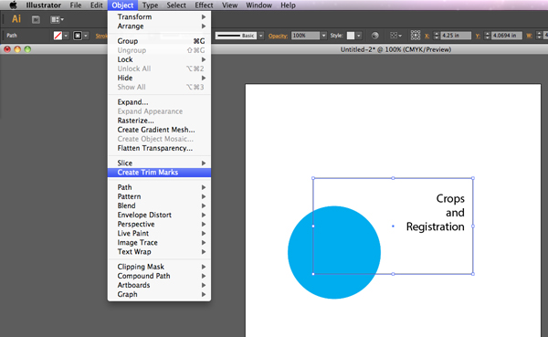
Step-by-step illustrator instructions from Boxcar Press on how to set up crop marks and registration marks

With the box still selected, click OBJECT > EXPAND APPEARANCE. You can now modify your crop marks, if needed.

Step-by-step illustrator instructions from Boxcar Press on how to set up crop marks and registration marks Step-by-step illustrator instructions from Boxcar Press on how to set up crop marks and registration marks

Option Two

Set your art board in Adobe Illustrator to the final piece size. You can set this when you click FILE > NEW and put your measurements in under length and width. If your art board is already open, select FILE > DOCUMENT SETUP > EDIT ARTBOARDS and resize if needed.

Once you are done creating the file, you can save it as a press quality PDF by going to FILE > SAVE AS > ADOBE PDF (file format).

A window will open – choose Press Quality PDF from the Adobe Presets dropdown at the top. On the left, select MARKS AND BLEEDS and click trim marks. You can also set your registration marks by clicking on the Registration Marks box. NOTE: The default trim mark thickness may be less the the required minimum line thickness for your plate type, so adjust this to be higher, if needed.

Step-by-step illustrator instructions from Boxcar Press on how to set up crop marks and registration marks

In most printing jobs, registration marks and crop marks should always be in Registration Black. That means they will show up on every color plate and will not affected by spot colors or other special markings added in design.

Feel free to contact our prepress team if you’re not sure if you need crop marks for your next plate order. They do add additional space and cost to your platemaking ticket, but may save you time and money in the long run.

Design tips for letterpress printing on chipboard

Available in several paper weights, our 100% post-consumer recycled chipboard is a popular paper choice for letterpress printing. Thick and textured, chipboard is kraft brown and completely utilitarian: we’ve printed wedding invitations, business cards, letterpress broadsides, and more on this versatile stock. Today we’re sharing a few tips from designer Angelena Bruesewitz on how to design for chipboard, along with some of our favorite examples of letterpress printing on this popular paper.

Design tips for letterpress printing on chipboard from Boxcar Press

Dark colors + bold lines are a great starting point.

Darker colors tend to be the easiest to work with when it comes to printing on chipboard – you’re sure to have contrast and legibility as long as your line weights are thick enough to be readable.

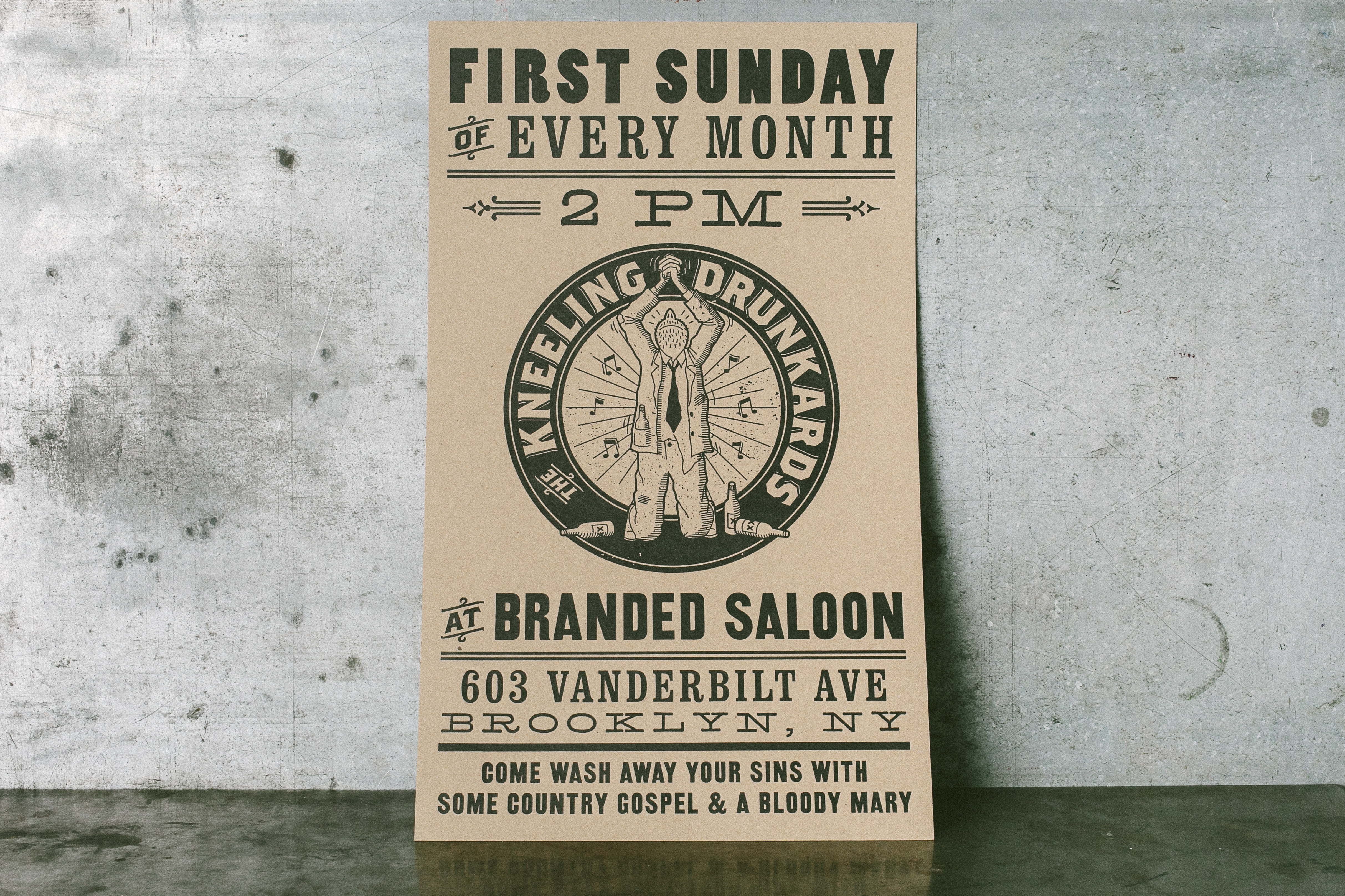
Kneeling Drunkards letterpress poster | Designed by Jarrod Taylor Design, Letterpress printed by Boxcar Press

Kneeling Drunkards 12″ x 20″ poster, job #25934. Designed by Jarrod Taylor, printed in black ink on 28 pt chipboard on our Cylinder Press

Bold letterpress business cards for UXA Lab - letterpress printed by Boxcar PressBold letterpress business cards for UXA Lab - letterpress printed by Boxcar Press

UXA Lab 3.5” x 2″ business cards, job #26428 for UXA Lab. Printed in Pantone 185U on 60pt chipboard on our Heidelberg Windmill Press

Tips for designing a low contrast piece.

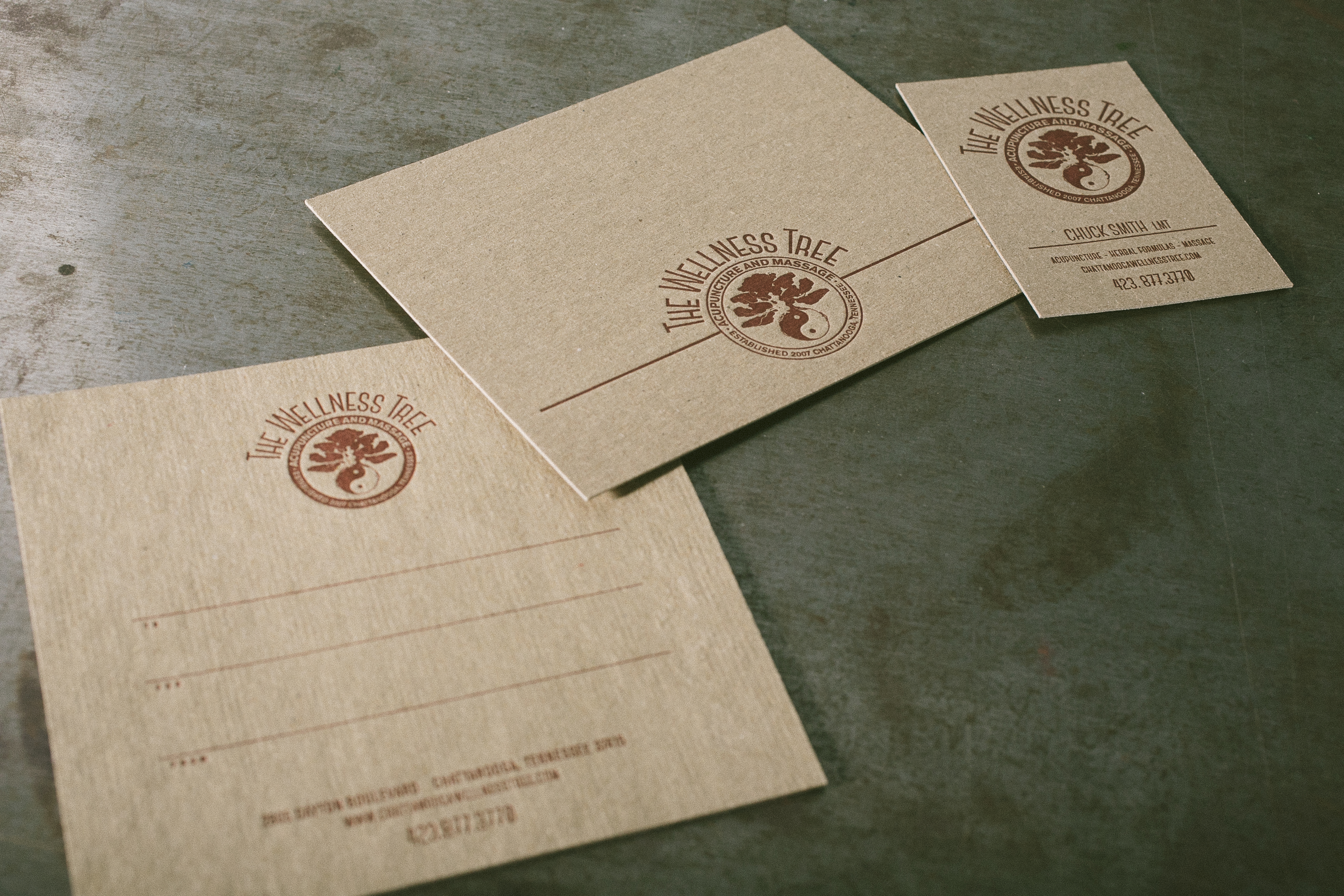
If you’re looking to create a low-contrast piece, make sure your line weights are thick enough to be legible. We recently worked with Angelena to create the identity suite below, which included a double-sided gift card with metallic gold ink on the back. The piece required a second run on press to achieve the desired look, but the end result was a subtle bamboo forest with lots of intricate details.

Letterpress identity suite for The Wellness Tree - printed by Boxcar Press, designed by Angelena BruesewitzLetterpress identity suite for The Wellness Tree - printed by Boxcar Press, designed by Angelena Bruesewitz

Identity suite for The Wellness Tree, jobs #26310 + 24962, designed by Angelena Bruesewitz at the Dandelion Shoppe. 2.5″ x 3.5″ business cards and 5.5″ x 4.25″ note cards, printed in Pantone 1805U on 28pt chipboard. 5″ x 5″ double-sided gift certificates, printed on 60pt chipboard in Pantone 1805U on the front, with a double hit of 874U on the back.

Keep the end use in mind.

When it comes to designing for chipboard and selecting colors and fonts to work with, keep your customer and the end result in mind. If you’re going for something rustic, Angelena recommends tone-on-tone. More fun and playful? Opt for lighter shades with more vibrancy to achieve the look. The earth tones used on the Bedford 234 business cards below matched the restaurant’s rustic, farm to table vibe perfectly.

Letterpress business cards for Bedford 234 | Designed by Sol Shim, printed by Boxcar PressLetterpress business cards for Bedford 234 | Designed by Sol Shim, printed by Boxcar Press

Bedford 234 3.5” x 2″ business cards, job #26802. Designed by Sol Shim, printed in Pantone 161U + 021U on 28 pt chipboard. 

If color accuracy is a priority, consider drawdowns or foil.

Just like printing on any other colored paper, color does shift on chipboard. If color accuracy is of the utmost importance for your clients, foil stamping may be a better choice than letterpress.  Alternatively, we offer a drawdown service for $50 per color if you’d like a test run to see how your color would look on our chipboard.

C_A11A2945Letterpress identity suite for The Wellness Tree - printed by Boxcar Press, designed by Angelena Bruesewitz

Faith Neidig 3.5” x 2″ business cards, job #24666. Designed by Kelly Moses Design, printed in black ink + gold shine foil on 28pt chipboard on our Heidelberg Windmill + Kluge presses. 

Red foil stamped holiday cards - design by Jenny C Design, printing by Boxcar Press

Custom 4.25″  x 5.5″ holiday cards, job #25576. Designed by Jenny C Design, printed in red shine foil on 28pt chipboard on our Kluge.

Go a shade brighter to achieve richer colors.

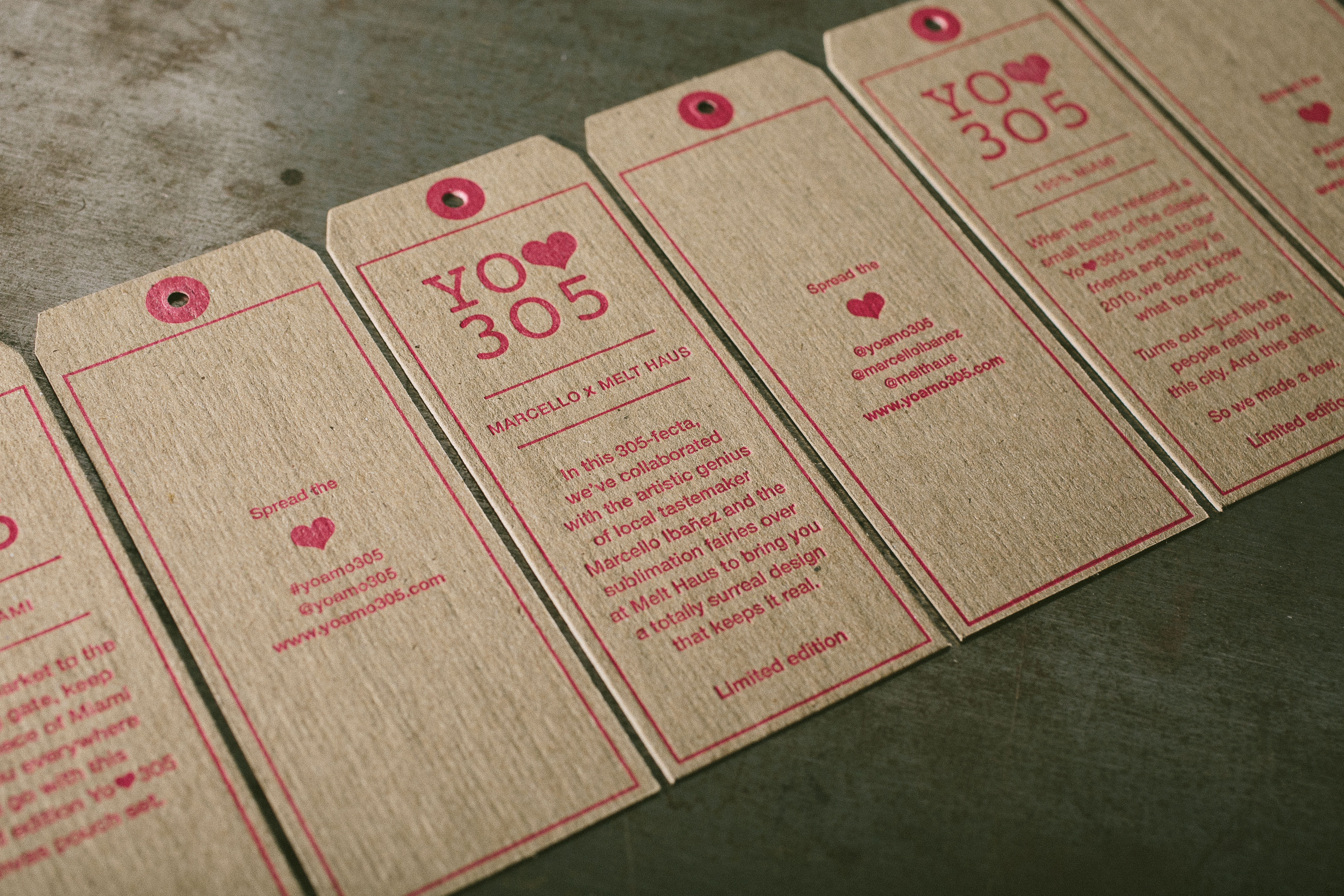
Because ink colors may appear more dull or muted on chipboard, we recommend going a shade brighter in order to compensate for the difference.

Die-cut product tags - letterpress printed on chipboard by Boxcar Press Die-cut product tags - letterpress printed on chipboard by Boxcar Press Die-cut product tags - letterpress printed on chipboard by Boxcar Press Die-cut product tags - letterpress printed on chipboard by Boxcar Press

Yo Amo 305 1.69″ x 4.25″ product tags, job #25740. Designed by Wynwood Letterpress, printed in Pantone 806U on 28pt chipboard on our Heidelberg Windmill.

Keep size and paper weight in mind.

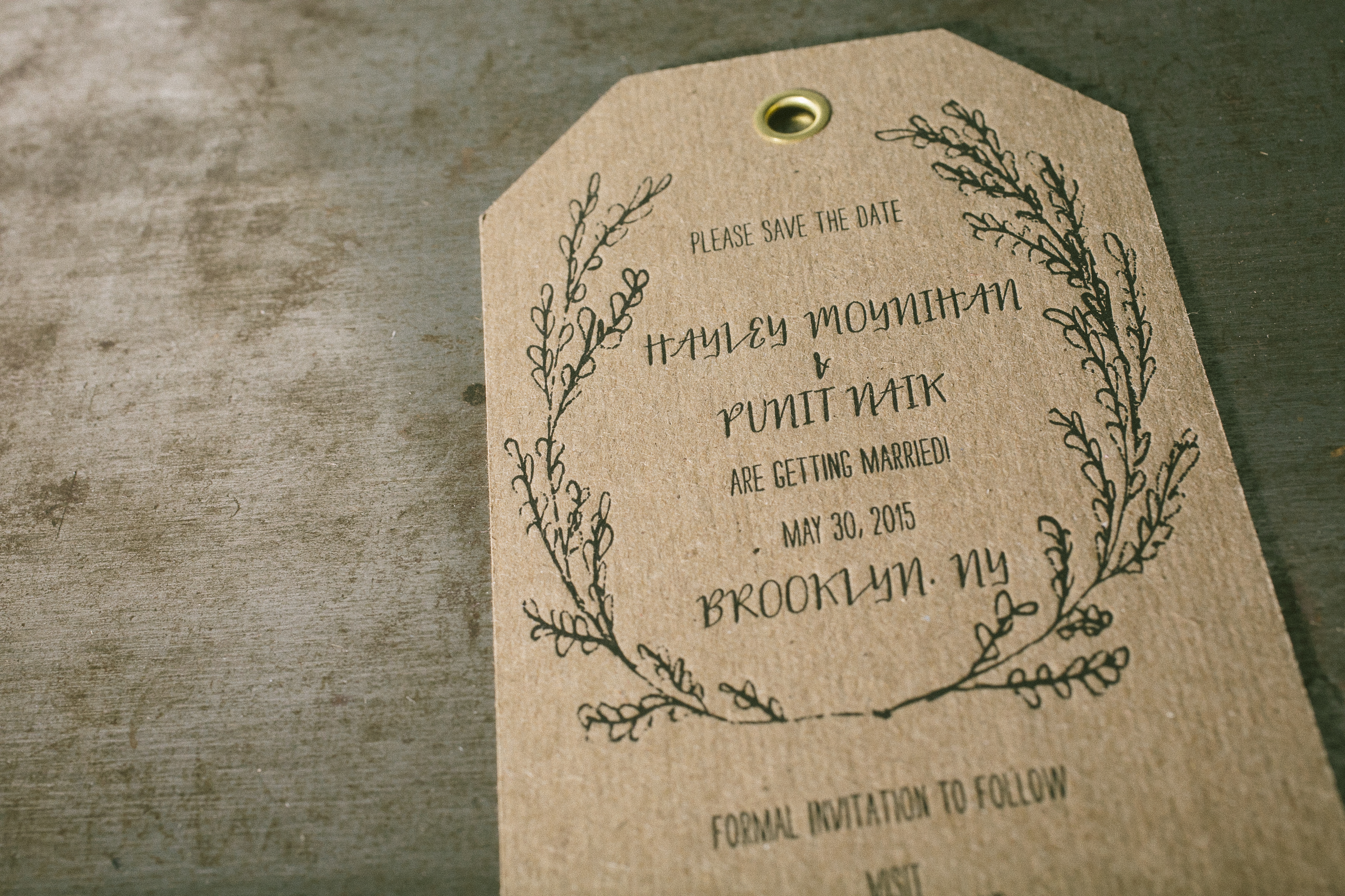
When it comes to working with chipboard (or any thicker papers), be sure to check your margins when you’re designing – you’ll want to make sure your cards fit in your envelopes! Additionally, postage weights may increase when it comes to heavier paper stocks, so make sure your client is comfortable with any added costs. Lastly, when it comes to sizes and shapes: we’ve found that 60pt chipboard is too thick for die cutting (though we have had success with 40pt chipboard). If creating a unique shape is important, consider straight cuts – the save the date pictured below was trimmed on a regular cutter, but has the look of a die-cut shape.

Letterpress + die-cut save the date tag with gold grommets - designed by Kristin at Reverie Made, printed by Boxcar Press Letterpress + die-cut save the date tag with gold grommets - designed by Kristin at Reverie Made, printed by Boxcar Press Letterpress + die-cut save the date tag with gold grommets - designed by Kristin at Reverie Made, printed by Boxcar Press

Custom save the dates 3.25″ x 5.5″ luggage tag style, job #241166. Designed by Kristin at Reverie Made, printed in black ink on 28pt chipboard. 


Our final piece of advice? Don’t be afraid! Experiment and have fun.

Twelve Little Books All In A Row

Small on size, big on letterpress love is the cheerful theme surrounding the Virginia Arts of the Book Center’s newest Kickstarter project, which aims to complete 12 finely crafted, hand-made artist’s books. And you can help bring more letterpress into the world by supporting the project!

Check out the Miniature Book Project Kickstarter project and pledge today.

Free Summertime Graphic Vector Set

The sun shining, the beaches overflowing, and the yummy smell of barbecue season lets us know that summer is (finally!) in full swing, printing aficionados! Catch a memory with our free summer themed vector set. which includes beautifully ornate borders, a fun summertime text set, and a pair of beached-themed shells for your letterpress designs. All are free for use and in both EPS and PDF format.

July 2013 Free Vector Art contains shells, ornate border, and fun summertime sayings.Summer Fun letterpress cardSummer time text letterpress printed with purple ink.

Free Cozy Winter Vector Set

Leaves crunching under your feet, the glittering twinkle of a first snowfall, and the yummy smell of homemade cooking lets us know winter is on its way, dear letterpress lovers! So to kick off the cozy holiday season, we’re spreading the joy with a free winter themed vector set! This set includes joyful winter wishes, a determined hockey player, a festive Thanksgiving tom, and a delicious cup of cocoa to warm up your letterpress designs!  All are free for use and in both EPS and PDF  format. Cheers!