A Printing Tradition: Sargent Brothers Press

Since our last visit with ever-charming Ben Sargent of Sargent Brothers Printers & Typographers, we toured his wonderful Texas-based printing abode. A few printing treasures and tools may have been moved around & added to, but Ben’s cheerful demeanor while printing on his C&P 10×15 Old Series has never missed a beat yet. We caught up again with Ben between ink runs to see how the printing tradition still runs strong in his family (like father, like son), why the down-home feel of a good letterpress print shop can’t be beat, and scored some nifty inking tricks to use on an older platen press.

Ben Sargent smiles wide in his Austin, Texas-based letterpress print shop (Sargent Brothers).

INK IN THE BLOOD I was born and grew up on the windy plains of the Texas Panhandle, where I learned the printing trade from my father. After getting a journalism degree from the University of Texas and putting in a few years as a reporter, I spent the next 35 years drawing political cartoons for the Austin American-Statesman. Retirement from that job gave me ample time to pursue my original trade, and I am enjoying it hugely.

Beautifully letterpressed blue and white wedding invitation featuring hand illustrated flowers is printed by Sargent Brothers out of Austin, Texas.

TEXAN TREASURE I’m fortunate enough to have a big enough property in South Austin to have built a nice little house (my one architectural accomplishment) as a home for the printing shop, and it is very satisfying to have a space built just for printing, not in the way of anything else. (Okay, it does also include a model-railroad layout along the walls above the type cabinets.)

Beautiful signage hangs on the door for the Sargent Brothers press shop in Austin, Texas.

FOR THE LOVE OF LETTERPRESS My father and his brother (the original “Sargent Brothers”) took up the trade as teenagers in Fort Worth in the ‘20s, and while newspaper careers took them both away from printing for many years, my dad got back into the trade when I was 12 years old. He purchased a Kelsey outfit with which he taught the craft to me and to my brother. Three years later, he brought the C&P 10×15 Old Series job press of his boyhood back home, and that is still the press I use today.

DESIGNED TO PRINT I enjoy designing printing, especially if it’s with metal type, but for almost all my commercial jobs I defer to the excellent creative efforts of the several graphic designers with whom I work.
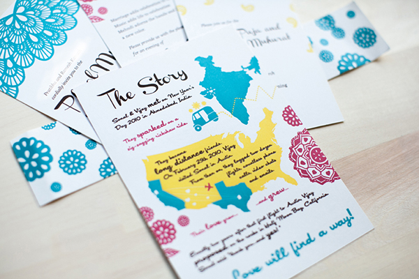
Eye-popping color comes to life via Ben Sargent's lettepress wedding invitation pieces.

FULL TIME Since my schedule is my own these days, I guess one could say that printing is not only full-time, but 24-7, since I can take care of a client’s needs whenever fits their schedule. It’s been thus since I left regular syndicated cartooning a year or so ago, freeing me up to devote more time to the trade.

PRINTING FEATS I see that as the goal, however imperfectly achieved, of every job we do, to give the customer something we’re proud to stand behind. Still, there are certainly some pieces we’ve done over the years that do stand out, and I have a particularly fond regard for the various little handset books we’ve published (including two editions of our specimen book, and a brief history of the platen job press, published to commemorate the centennial of my press back in 2005).

Ben Sargent of Sarget Brothers sets up his Kort Guage Pins for his next printing run in Austin, Texas.

BOXCAR’S ROLE Oh, goodness, since almost all my commercial jobs are printed with Boxcar plates, it’s fair to say Boxcar is the sine qua non of our business. The plates themselves are always flawless, of course, and the service always timely, but by far the best part is the personal touch by which the staff, particularly Rebecca Miller, are always available and cheerfully willing to help us through the occasional digital-file nightmare, etc. I know you must have other customers, but I am always made to feel like Boxcar is there just waiting to meet Sargent Brothers’ needs. Thanks!

FIRST PRESS I learned the fundamentals on a Kelsey 5×8 Excelsior.

SHOP TIPS I think every printer, particularly one such as I who mostly works by himself, probably comes up over the years with dozens of tricks and techniques as he puzzles his way out of particular problems and situations, until they become just part of the craft, and he forgets they were once experimental innovations.

I can think of a few we’ve come up with, and they are probably worth some separate blog entries, so I’ll just cite one we’ve been having some luck with lately. Everybody who uses one of the older platen jobbers such as ours knows that the relatively unsophisticated inking system sometimes requires a little ingenuity in the case of relatively broad inked images. (Not big, huge color floods….with those I have learned the wise adage of one of my colleagues that “in letterpress, sometimes it’s okay just to say no.”). But for reasonable-sized bold areas, I’ve found they can be conquered with a couple of drops of something like Smooth Lith in the ink mix, and with providing a soft place for the impression to land, either by putting a couple of sheets of newsprint between tympan and pressboard, or even pasting some newsprint directly on the tympan (particularly if one is just trying to cover some limited areas). Also helps to “skip-feed” the pieces, so the ink has a little extra time to recover between impressions, and in some cases to go to the trouble of making the design into two press runs, one for the bold areas and one for the finer images. And I’m always receptive to anyone else’s ideas for this conundrum!

WHAT’S NEXT Job work has reached a fairly steady and comfortable level over here, and we look forward to getting the word about our offerings further out by word-of-mouth and our website. I’ve also had the privilege of working with a few young newcomers to the trade, and hope to continue in that way to keep letterpress thriving and growing.

A mighty round of thanks go out to Ben of Sargent Brothers Printers & Typographers for letting us take another peek into his sublime printing paradise.
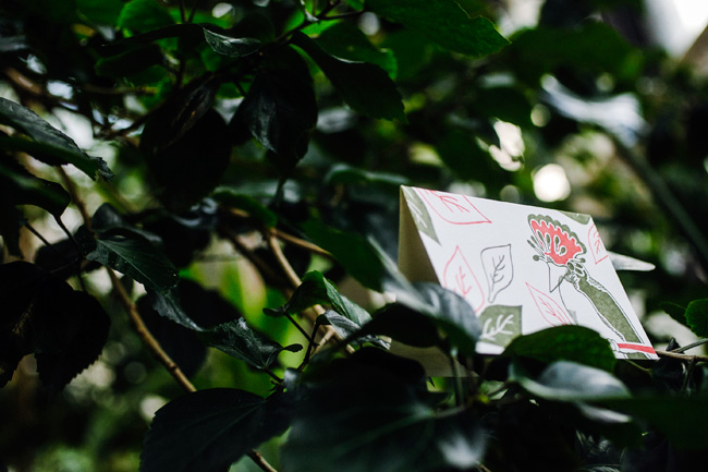
Letterpress inspiring hope this holiday season

Rebekah Tennis of Wild Ink Press says it so simply, “The wonderful thing about printing for a cause is that you can spur others on to action as well.”  Rebekah is one of our spotlighted printers who incorporate their creativity and presses in the art of doing good. These printers firmly believe that they benefit as much as their receiving charities in their enjoyment and satisfaction with making a difference.  Whether it’s a global cause or a local one, these printers lend their talents and hearts and urge others to take on a non-profit to help out.

Smock

A few years ago, Smock launched a Change the World card series, where 100% of profits from card sales are donated to specific environmental charities. The latest card in the series is the Rainforest card, and 100% of the profits from this card are donated to the Amazon Conservation Association to help protect the rainforests. The cards are sustainably letterpress printed on Smock’s bamboo paper, and are paired with 100% post-consumer recycled, FSC-certified kraft envelopes. Smock also offers Sunflower, a card that benefits the Pesticide Action Network; Fracking, a card that benefits Earthworks; and Fin, a card that benefits the Monterey Bay Aquarium Seafood Watch. Smock also donates 1% of sales to environmental organizations as a member of 1% For the Planet.

Smock rainforest cards

That Grace Restored –  Kate McGaughey

At Atlanta, Georgia based That Grace Restored, we collaborate with women who have been exploited in the commercial sex industry to make fine quality handmade journals and letterpress products with the purpose of seeing the women reach self-sufficiency and renewed personal dignity. Our product itself speaks to the healing and repurposing of each woman’s life – we craft handmade paper out of used, seemingly unwanted scraps of paper and make them into beautiful, unique pieces.  Letterpress enhances the quality of our product while complementing the texture and character of the handmade paper.

ThatGraceRestored-IMG1

That Grace Restored is a social enterprise of Serenity’s Steps, a 501c3 in metro Atlanta that helps women step out of the sex industry. That Grace Restored was launched as an employment and vocational development opportunity provided through Serenity’s Steps in October 2013. We currently employ two women at approximately full-time hours and two women on a contract basis. We print on a Vandercook 215, a Vandercook SP15, or a Chandler & Price Old Style platen press 8×12.

We are selling holiday cards currently. We keep our designs simple and elegant to allow the marriage of our printing and handmade paper to tell a story. Each product speaks to the beauty found in the imperfect. We use rubber-based inks. Our paper is soft and takes on beautifully deep impressions well without straining the relic machinery. By purchasing this product, our women have an opportunity to receive a fair wage as artisans and achieve goals through vocational development.

May Day Studio – Kelly McMahon

In the fall of 2011, Hurricane Irene swept through the state of Vermont, causing the water levels in all of the rivers to rise, and subsequent widespread flooding and massive destruction. A few months after the hurricane, Kelly McMahon of May Day Studio was driving though one of the hardest-hit areas, and was astounded that entire towns still seemed destroyed and abandoned, fields of flattened crops where thriving farms once were, and the amazingly new wide and deep rocky paths of the rivers. Many of Vermont’s towns are built on rivers–which makes them lovely to live in, and terribly dangerous during high waters.

MAYDAY-IMG2

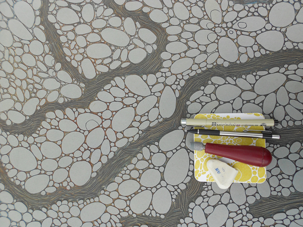
Kelly saw patterns in the destruction and out of this, designs were born, She started with small, simple sketches, thinking that a little card line or something would come of it…but the designs couldn’t be contained! They are now 18″ x 24″ hand-carved linoleum blocks which she has turned into gift wrap and tote bags. She calls her design Field print, which represents Vermont’s gorgeous fields of thriving crops.

It seemed a natural leap to think of the Vermont Disaster Relief Fund and donating 10% of her sales from these items to this organization particularly because it was founded by Vermonters, for Vermonters, in a time of great need.

MAYDAY-IMG1

She prints her wrapping paper on a Vandercook SP20 at Green Mountain Letterpress in Fairlee, Vermont, since her little Vandy SP15 isn’t big enough. The wrap is printed from linoleum blocks, onto Mohawk text weight paper using Van Son inks. It’s available online through her Etsy shop and in stores around the country. Her design has also launched a screen printed tote bag whose sales generate a donation to the Vermont Foodbank.

Bristol Letterpress – Tracy Oakley

Working small and from your kitchen table can also reap donations to worthwhile charities. Tracy Oakley runs Bristol Letterpress from her studio (kitchen table…) at home, working on a vintage 8×5 Adana letterpress machine, which is gorgeous but sometimes temperamental.

Tracy sells through her Etsy shop, local shops, craft fairs and Cappuccino Cards. Cappuccino Cards is an online shop selling a fabulous range of beautiful artists cards and prints, all of which donate to charity. Helena Golunska, a good friend, runs this business – they set it up together, along with Bristol Letterpress, and so both are involved with each venture.

Bristol-IMG2

The letterpress Christmas cards printed this year are generating funds for Bowel Cancer Research and St. Mungo’s – the more money the charities get, the happier they are. Bowel Cancer Research is a cause dear to our hearts as Helena and Tracy have both come into contact with the disease through close family and friends. St. Mungo’s does some great work supporting those affected by homelessness – an issue that is particularly hard to deal with at this time of year when winter nights are cold and long.

Bristol-IMG1

When Tracy is not printing, she’s quaffing endless cups of tea with her South West England based Home Working Collective – a group of like minded people who work from their residences. Many of their items are sold through Cappuccino Cards, which is based on the principle that every card you send, all year round, could make a difference to a great cause. Each card sold on the site donates a whopping £1 to charity (a third of the price) and the customer gets to pick from 12 well deserving causes. Prints donate 10% of the retail price – so everything you buy on the site does some good!

Wild Ink Press – Rebekah & Matt Tennis

Over on the West Coast in California, Rebekah and Matt Tennis live their cause – Orphan Care. All three of their amazing children were adopted internationally, as orphans, so this cause is very personal and dear to their hearts. There are over 150 million orphans in the world. “Orphan” doesn’t just mean a boy or girl who has lost one or both parents, but it can describe a child who faces the world without the provision, care and nurturing that a family provides. There are also many ways to help the orphan – not just adoption, but also fostering, feeding, mentoring and providing for health and education. She and Matt give each year to several wonderful organizations with services that include foster care, feeding, education and clean water for orphans in the birth countries of their children (Pakistan and Korea).

Tennis-IMG1

“People love to be generous, I’ve found, which is wonderful. So, instead of Matt and I just giving money towards orphan care ourselves only, we can do that, but we can also say ‘here, let’s do this together and we can raise even more and make a big difference.’ It’s been great to involve other people in the cause.”, says Rebekah.

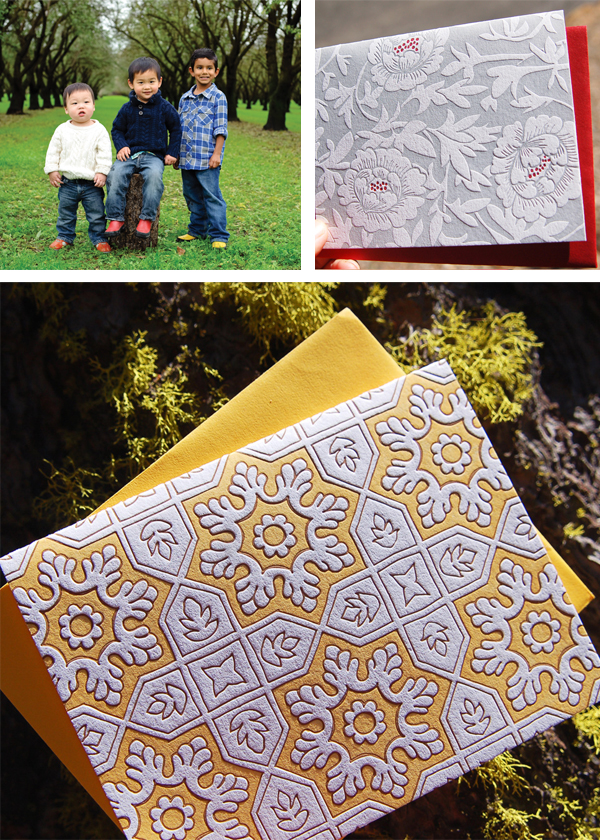
Rebekah’s four card designs are very influenced by the cultural heritage of her sons. They are from Pakistan and Korea, so the notecards were inspired by an intricate wall pattern found in Lahore, a tile pattern from Islamabad, as well as a lovely Korean celadon vase pattern, and lattice wall from a temple. She has interpreted and hand-drawn the pieces, and printed them in cultural colorways. It’s fun to have these pieces to show her boys their heritage. The notecards are sold as boxed sets of six and a little over $2.25 of each boxed set goes to orphan care – it adds up quick!


Tennis-IMG2

In their recently expanded and renovated digs — which used to be an old soda bottling plant — they print on three Heidelberg Windmills, old style Chandler & Price 10 x 15, a 1912 Golding Jobber, and a Vandercook Uni III.


Many thanks to these inspiring printers for sharing their cards (and causes!)! Are there some charitable letterpress cards that we missed? Share details with us in the comments section below!

DIY winter wonderland letterpress printed paper trees

With the temperatures dipping down in the freezing range these days, why not cozy up this holiday season with your very own forest of delightful paper trees? We offer a sparkling tree design but invite you to decorate your own using our blank tree template. We letterpress printed ours in an icy blue ink and handed them out at a recent open studio event for visitors to try.

tree-photo-2-1

Download your copy today as all are free for use. Each file is formatted to print on 11″x 17″ paper and is rated as beginner skill level. We recommend using a glue stick on the tabs to secure the different levels together, and found that tape can sometimes come in hand to secure any stubborn branches.

Templates:
With sparkling snowflake design: EPS & PDF
Design your own decorations (plain): EPS & PDF
Hint: dotted lines indicate fold lines and solid black lines indicate cut lines. Enjoy! 

2014 Letterpress Printer’s Holiday Wishlist Roundup

The winter holidays are upon us and we’ve got you covered for that special printer & letterpress aficionado in your life. Check out our favorite holiday letterpress gifts, printing must-haves, and a few DIY letterpress presents. Share your favorite letterpress gift ideas in the comments section below!

2014PrinterWishlist-IMG-A

1. Metal or wood Type from Etsy (don’t forget type cabinets to hold your finds!) | 2. Letterpress printing press t-shirts from Boxcar Press (to declare your printing love) | 3. New tree-free paper from Reich Paper – Aveo (made from sugar cane). | 4. Paper Micrometer on Ebay (a handy must-have tool for measuring paper thickness)  | 5. Letterpress Fabric from Michael Miller Fabric (to brighten up any pressroom)  | 6. Clampersand by Hand-eye Supply (hold down paper in style with this clever c-clamp)

2014PrinterWishlist-IMG-B

7. Downloadable letterpress poster files from the Museum of Printing (get crafty: print out & frame to your heart’s desire) | 8. DIY Typography Lantern from Font Crafts (Make your own tailored lantern!) | 9. Pantone 2015 Color of the Year: Marsala Coffee Mug by Pantone (sip in style this year) | 10. Beautiful printing apron from the Ladies of Letterpress (tres chic!) | 11. Bamboo typography rug from Ebay (comes in 3 sizes) | 12. Swing Away Lay Gauge from Boxcar Press (for that hard-to-gift-for Heidelberg Windmill aficionado)

Letterpress Art Prints by Rabbit Wife Pen and Ink

Recently we worked with husband & wife team Mary Ann and Jesse Watkins from Rabbit Wife Pen and Ink on a Sufjan Stevens inspired letterpress art print. Letterpress printed in crisp black ink on 60 pt chipboard, the art prints are 6″ squares with playful hand lettering. Mary Ann shared the backstory on the prints – take a look.

Letterpress art print from Rabbit Wife Studio - letterpress printed by Boxcar Press

I love words. This is one of those phrases that becomes anthemic for a season. The song, “The Dress Looks Nice on You,” will forever take me back to my college boyfriend’s car almost ten years ago. Now he’s my husband, Jesse, and our lives are messy and ragged and achingly beautiful, strewn with life and light. There are days when I am emptied and tattered. But I see my boys with their Papa, riding their bikes down hills in a graveyard near our house in the amber of the day, bathed in sunlight, marching through mountains of leaves. These images are stitched together in my mind like a home-spun slide show. I can see a lot of life in them; a lot of bright in them.

This design is the first thing I sent to print. It was invigorating and life-giving to work on. I would close my eyes at night and see the letters fitting together, like Tetris pieces. I sent it off to Boxcar and shortly after, one hundred letterpress prints sat on my doorstep. I’m thrilled with how they turned out. The thickness of the chipboard is perfect and exactly what I had in mind. And the tactile experience of the letterpress indentions is dreamy.

Letterpress art print from Rabbit Wife Studio - letterpress printed by Boxcar Press Letterpress art print from Rabbit Wife Studio - letterpress printed by Boxcar Press

The art prints are available for purchase on Rabbit Wife’s Etsy shop! Many thanks to Mary Ann and Jesse for collaborating with us on this new venture.

The Bucket Series: Limited Edition Letterpress Maps & Prints by Reva and Tommy Nafso

We were excited to work with Reva and Tommy Nafso on a few letterpress prints for their new Bucket Series, a unique project that connects Experts and Artists to create a series of limited edition, curated letterpress art pieces. The experts provide a bucket list, the artists interpret each list into a map, and then they are letterpress printed. A new volume is issued every month, with a limited run of 100 prints created for each volume.

Bucket List Poster Series, Vol. A: The College Football Volume.

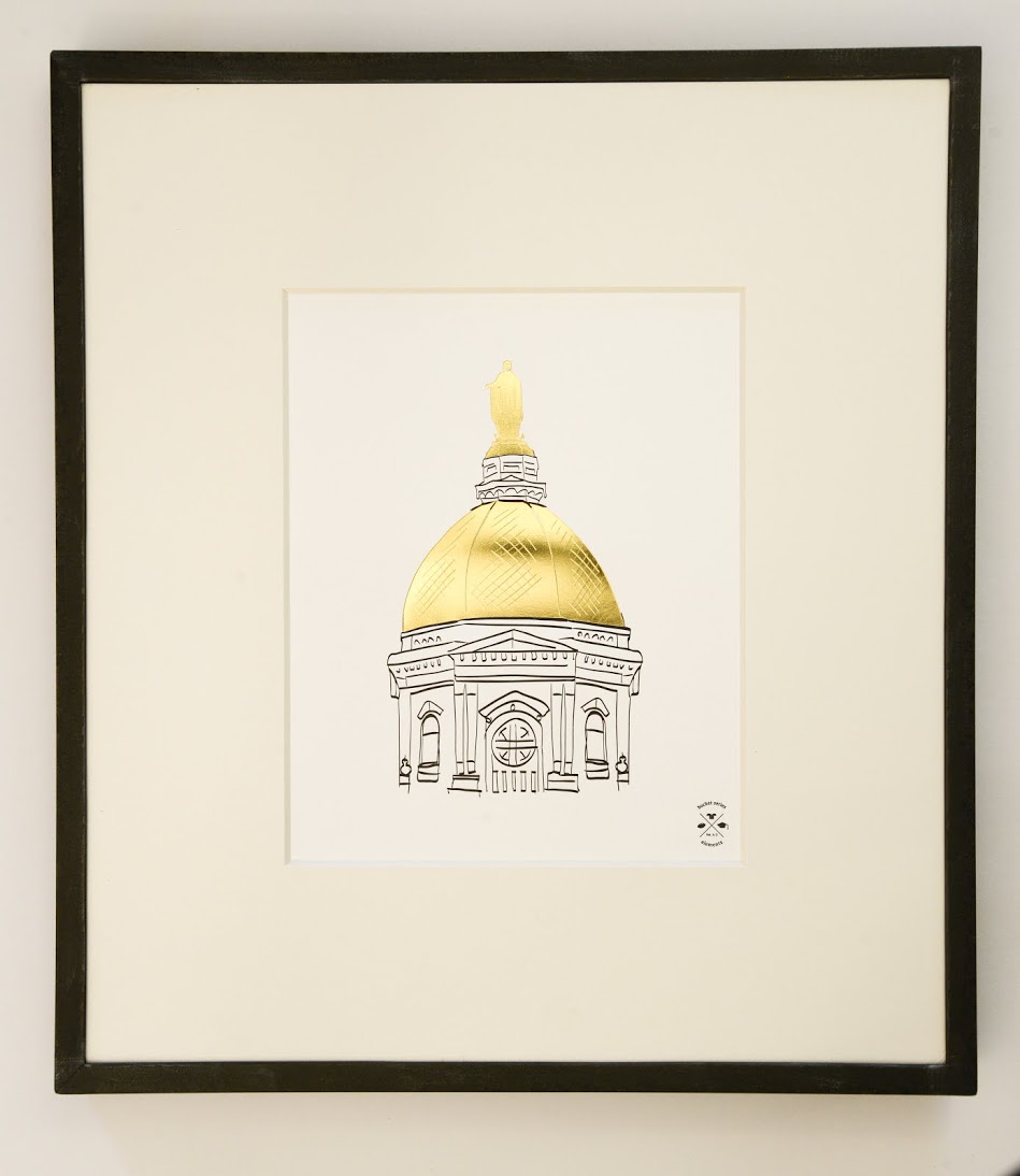
The experts can submit a Bucket List with any theme – from arts to travel to gastronomy. For example, a European travel expert can create a “When in Rome” list, while an art expert can provide a list of must-see art museums, and so on. After the list has been crafted, the Bucket Series Art team — which consists of Marilia Beltrame from Brazil, and Mike Swallow from England — works with a new featured artist each month to interpret the list into an 11×17 map. In addition to the map, two 8×10 minimalist letterpress prints showcasing individual design elements from the map are created with each volume. Gold foil is used to accentuate one of the two art prints.

For their Kickstarter project, the Bucket Series has created 2 exclusive volumes: A – The College Football Volume and B – The European Volume. We had the pleasure of printing the College Football volume, which includes approximately 50 illustrated college football traditions, along with a gold foil emblem. The two corresponding 8×10 art prints from this volume show off Yale’s Handsome Dan and Notre Dame’s Golden Dome, in gold foil. These are backer rewards and ship once the campaign is fully funded and complete, and before the holidays. Volume B, the European Union bucket list, will be printed in early December and will hopefully ship before the holidays.

Bucket Series Vol. A: The College Football SeriesBucket Series Vol. A: The College Football Series

Visit the Nafso’s Kickstarter page to support the project and check out their schedule for 2015!

Photos provided by Reva Nafso. 

Printing Festivities at Fitzgerald Press

If you are looking for a printer to work elbow to elbow with and soak up some letterpress magic, consider John Fitzgerald of Fitzgerald Press in New Orleans. John works solo in his shop down in the Deep South, but he recently opened his doors for us to see his creative and functional printing workspace.

john-fitzgerald-img1

COMING BACK TO THE BEGINNING. Let me introduce myself by saying that I feel like I occupy a place in the ever changing print scene. When I was in Junior High School I took Print Shop. I was drawn to printing even earlier after seeing my older sister’s art class lino cuts. This was the 1960’s and the last of letterpress was still hanging on in the commercial print world. In Jr. High they still started us on letterpress, even though the advanced students were doing offset lithography. By the time I got to trade school it was all offset as was my career in commercial printing, until the digital takeover. By the late ’80’s jobs were getting harder to find and I never really liked offset printing anyhow. I’d always done little lino cuts and special letterpress jobs on equipment that I scrounged from old letterpress shops and could fit in the garage. So I turned to letterpress printing as a full time job as the ‘90s began. All this to say that I saw commercial letterpress die and be re-born as high craft. I never went to art school and my orientation is towards production. Still I treasure the artistic side of the trade and find myself right at home in this revived letterpress world.

PRINTING CHIC DECOR By far my favorite thing in my workspace is my old cherry wood handled copper riveted ink knife that I’ve had for 30 years. My space has two big windows that let in natural light. I also have an overhead fluorescent fixture and use these with a combination of clip lamps and floor lamps. I think of my shop as a working shop, and decoration is definitely an afterthought. I have prints and posters from friends and colleagues on the walls but that’s about it. Equipment and workspaces line the walls, and I have an island in the middle, that includes the proof press, pilot press and galley.

MEET THE FAMILY  I have five presses – a C & P Craftsman, an original Heidelberg 10″ x 15″ (Windmill), a C & P Pilot 8″ x 10″, a Printasign Duplicator Model 40 Sign Press (that I use as a proof press) and a Kelsey 3 x 5″  (that I use to bring to shows for demonstrations).

HEAVY METAL HOME I rent space in a one story cinderblock building, on Saint Bernard Ave, in the Seventh Ward of New Orleans, between the Treme and Saint Roch neighborhoods. My space is a 18′ x 25′ rectangle, and the rest of the building is occupied by the owner (Red Metal) who is a blacksmith artist.

DRESSING THE PRESS  My most valuable tool is my C and P Craftsman 12″ x 18″ press. I have two Boxcar bases, one thats 7.5″ x 4.5″ and one thats 12″ x 9″. I use a jet 94 FL plate and I’ve been using this set up for about 8 years now.

GOLD IS THE NEW BLACK  I use regular commercial offset inks (Zip Set). I mix custom colors using the Pantone system. My current favorite color is an improvised mix of dense black and 875 gold. This makes a super dense, warm and delicious black.

PROTECTING THE EQUIPMENT For clean-up, I scrape as much ink off the disk as I can, then run the press with a little kerosene to loosen things up. I do my major cleanup with kerosene and then finish the rollers with a roller wash (Varn V-120). I don’t like to use mineral spirits because it’s too strong. Kerosene leaves an oily residue that doesn’t seem to hurt ink colors and helps protect metal in this humid climate.

A PLACE FOR EVERYTHING THAT IS TYPE  I have no pied type! Over the years I’ve rescued a lot of type – much of it is now stored in gallery trays, but I keep it all sorted. Pied type is an offense!

SYSTEM THAT WORKS FOR ME  In terms of organization, the main problem I have is that I’m a solo operator and I fly by the seat of my pants. Every active job has a file folder in a rack on the wall, so I don’t lose track of things, but that’s about as far it goes for organization.

PROPERLY ATTIRED When I come into the shop, the very first thing I do is put on my apron. It’s like being in costume – I know I’m here to work.

YOU HEARD IT FROM ME   “Be attentive to ink roller height” is the best advise I have – getting the ink to contact the form just right is the key to good letterpress printing. I’d been printing for years before I really understood that.

john-fitzgerald-img2

Huge round of thanks to John for letting us take a tour of his wonderful shop!

2014 Seattle Children’s Hospital Letterpress Broadsides

For the past few years, we’ve collaborated with the Writers in the Schools program (WITS) and the School of Visual Concepts in Seattle, Washington, to create an inspiring collection of letterpress broadsides. Poets Sierra Nelson and Ann Teplick from the WITS program worked with long term pediatric patients at the Seattle Children’s Hospital to write poetry, and the artists use the poetry to create beautiful letterpress broadsides. This year, 20 artists worked on the project to create 20 prints for the Seattle Children’s Hospital Broadsides project. We supported the project by donating photopolymer plates to help offset the product costs involved with creating this limited run (only 110 were created!) of broadsides. Here are a few photos from this year’s beautiful collaboration – as well as photos of the artists who letterpress printed the broadsides!

2014 Seattle Children's Hospital Broadsides project2014 Seattle Children's Hospital Letterpress Broadsides

2014 Seattle Children's Hospital Broadsides - letterpress artists 2014 Seattle Children's Hospital Broadsides - letterpress artists 2014 Seattle Children's Hospital Broadsides - letterpress artists

2014 Children's Hospital Letterpress Broadsides

2014 Children's Hospital Letterpress Broadsides2014 Children's Hospital Letterpress Broadsides

Artist photos courtesy of the School of Visual Concepts 

Burning Bright At Small Fires Press

New Orleans is the home of soulful jazz, the po’ boy sandwich, and a famous pirate or two.  And sure, it is frequently steamy-hot, but that is the chosen locale of the letterpress print shop Small Fires Press. Husband and wife team Friedrich Kerksieck and Gabrielle Trimm took to New Orleans like true natives and have set off some major sparks in the growing letterpress community of The Big Easy. Step into their workspace and you may smell something unexpected blending with the usual print shop aromas…is that pie? To celebrate their one year anniversary of printing and bookbinding, Friedrich and Gabrielle gave us a peek inside their studio – take a look.

Small-Fires-Press-letterpress-1

Bienvenue En Louisiane Our studio is in the front parlor of our New Orleans shotgun style home. The windows and natural light are a necessity and favorite feature. We have overhead lighting, but mostly use a 3-bulb floor lamp by the press and let the sun do the rest. We keep it simple to maximize space, but keep a California job case drawer on the wall to house little figurines and some framed art for inspiration. The red handles on the paper cutter and guillotine serve as ‘pops of color.’

Streetside Studio Our building is a pink double shotgun in the Saint Roch neighborhood in New Orleans. The studio is set up in the first room and we live in the other three rooms of the house. The studio is 14×13’.

Better Than Gumbo Our most valuable tool has gotta be our Vandercook #4, of course.

Dressing the Press We’ve been using a 13” X 19” standard Boxcar base I got when I purchased the press five years ago. I generally stick to the KF95 plate.

Fluorescent Favorites I bought a set of blue, magenta & yellow neons not too long ago. I don’t usually get much call for them in the job work I do for clients, but whenever I’m doing a creative project I usually go right to those cans.

Green For Clean I put a little bit of vegetable shortening to loosen the ink up & use some shop rags to wipe everything down with. Then I go over everything again with some simple green or mineral spirits depending on what color is going on the press next.

Loose Bits I don’t have any pied type any more – the small bit that was left got abandoned when we moved from Memphis last year, but I’ve still got a few drawers of type that need to get reorganized.

Less Is Better I’ve found that I work better with a little less tabletop space. I tend to fill up what ever is available and am bad about putting projects away unless I have to. In Memphis I had a folding table set up in the middle of the space to work off of and the top of my flat files collected odds and ends. Now I’ve ditched the table 95% of the time & just work off the flat file. Now there’s a lot less to knock over or walk around.

Studio Cats Working from home is convenient and comfortable. It’s nice to be able to do some slow cooking or pie baking in the kitchen while there’s ink on the press. We can trade off on household tasks and printing tasks when needed and everything is all in one place. Our two cats keep good company. Bip has a bed right at the end of the press & he sleeps there while I’m printing away.

Collaborate For Inspiration I think that the very best practice is to print every day. Nothing will keep you fresher. That, and always be curious – especially with visiting other presses and print spaces. I love that in New Orleans there are so many new and established printers. My favorite thing to do is to go print a project with someone else and see how they work – what they do for makeready & the rest of the process. Everyone does things a little differently and you can always pick up a good tip or two.

Small-Fires-Press-letterpress-2 copy

Our thanks to Gabrielle and Friedrich at Small Fires Press for the southern hospitality; continue to let the good times roll!

Let’s see that printed: Dia de los Muertos letterpress cards from Pablo Delgado

From start to finish, watching the production of a custom photopolymer plate is fascinating. From the genesis of a digital design file to hand-inspection of a pulled proof, the transformation of light-sensitive photopolymer to a vehicle for endless hours of printing fun is curiously intriguing. We followed one of Pablo Delgado’s recent plate orders as he had fun using the plate on the at-home Fiskars Fuse system to create letterpress cards.

Delgado-img5-1 Delgado-img6-1

Starting out, I went with the Fiskars Fuse because of the maximum size for the platform. At 12 inches it is double the max width on the Quickutz Epic Six. The first problem was that there wasn’t a platform available at the 12 inches that would allow me the registration necessary to print on the precut A-6 size cards. So I ordered two 12″x12″ clear cast acrylic sheets from Tap Plastics. The bottom piece was .472″ thick and would work as my base for the cardstock, and the top piece was .236″ thick and would act as the chase for the photopolymer plate. I cut a heavy white plastic in two strips to work as hinges and put it all together. It looked a bit crude, but it worked great and I am able to take advantage of the wider roller length. I adhered a sheet of hard heavy white plastic to help achieve the thickness necessary, and a couple of thinner sheets with grids on them to help with placement. The ink I am using for the particular card I am showing are both Great Western Ink oil based Pantone 185 and Reflex Blue.

Delgado-img1

I began with a one color card to figure out the process, and this went fairly smooth. I played around with packing to get the depth I wanted and when I accomplished this I took the leap into a two color card. This was a challenge. Keeping an even consistency of the two inks on the brayer was difficult to figure out at first. I had to try different ways of getting enough but not too much ink on the rubber roller without causing ghosting or plugging up the detail. In the end a couple of thin coats seemed to work best as the perfect balance. One trick I learned to keep the messiness down was to put some transparent tape on the plate strips so when I rolled out the ink on the plate, I could lift off the inked  tape and the strip remained clean. I had a lot of fun figuring out this process. It definitely requires a good bit of patience, the ability to look at things analytically, and organization to keep the ink only where it belongs. The rewards of seeing your art reproduced in vibrant colors and beautiful stock outweighs any of the downsides you experience.

Delgado-img2

The art I am using is original. It is inspired directly by the traditional “Dia de los Muertos” style of images that depict “calacas” (skeletons) and “diablitos” (little devils) in humorous and satirical poses. “Amor Eterno Artesanias” is the name that I am creating under.

Delgado-img3-1

It has been a journey that has taken several years to come together, and the work is only just beginning. I had not been able to find the right medium to share this art through before, so I am very thankful to Boxcar Press for not only putting out information on how to create these letterpress images, but also the personal assistance they offer. Whatever this venture may turn in to, it’s reassuring to know that Boxcar Press is there to help out in any way they can.

Huge round of thanks out to Pablo for letting us get a closer look at his beautifully printed pieces!