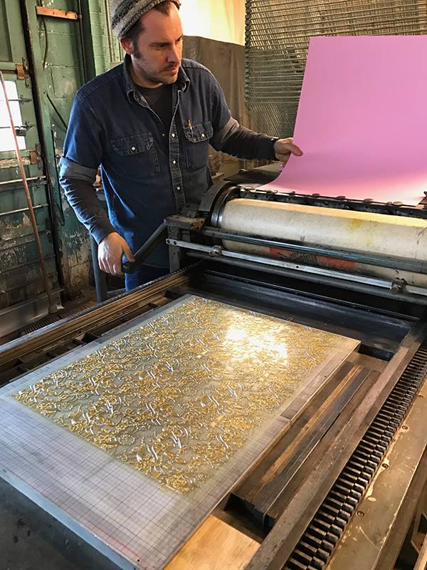
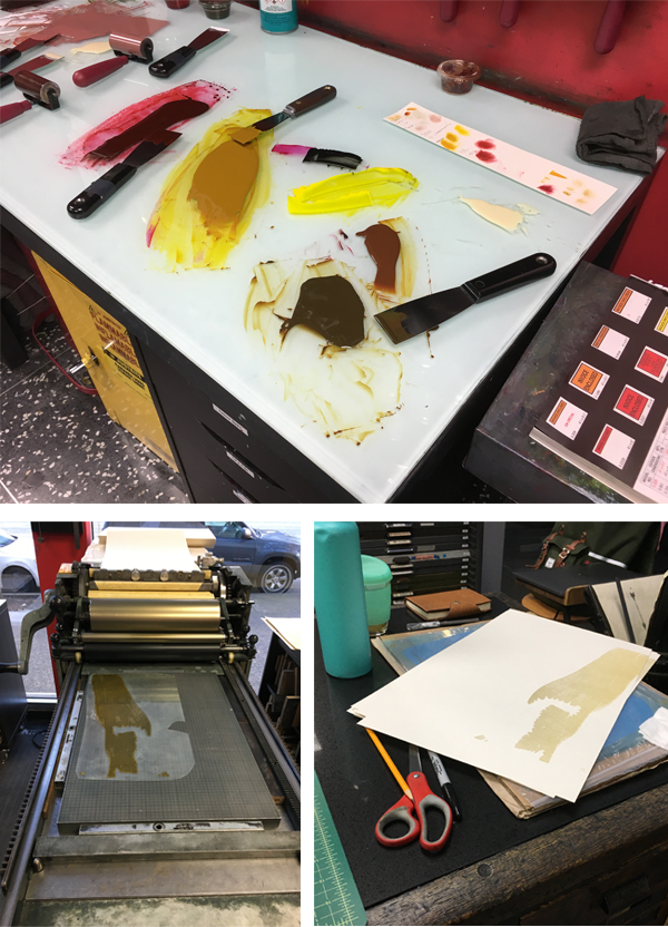
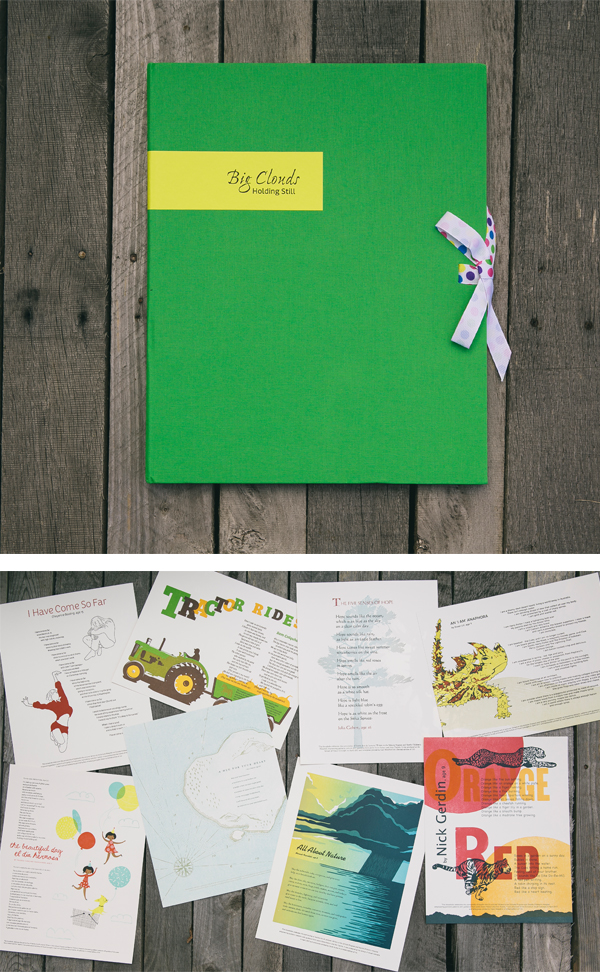
2017 Seattle Children’s Hospital Broadsides: Part 2

Part two in this year’s inspiring blog feature of the Seattle Children’s Hospital Broadsides project explores the work of five more clever printers and their young poets as part of the collaborative effort between the Writers in the Schools program (WITS – a poetry program spearheaded by Sierra Nelson and Ann Teplick), long term patients at Seattle Children’s Hospital, and the School of Visual Concepts. These five printers share with us how they brought to life the young poets’ colorful imagination in a cornucopia of color, text, texture, and fun imagery.

Jane Suchan While at Seattle Children’s Hospital, 14 year old Mary McCann learned to knit and wrote the two poems used for her broadside.  I was drawn to Mary’s poems because of their emotion and imagery.  I work at Seattle Children’s, so I had the good fortune to visit and get to know Mary a bit.

Jane Suchran letterpress prints for 2017 SVC Children's Broadsides.

As Mary and I were chatting she gave me some great design input: her favorite colors, the fun to be had with a ball of yarn, the sense of coziness and comfort she feels from sitting quietly and knitting.  Mary is creative, energetic and playful, so I sought to reflect those characteristics in my design.  Since we both have orange cats, and cats and knitting just naturally go together, I knew I wanted to include a cat somehow as our shared secret.  

Jane Suchran letterpress prints for 2017 SVC Children's Broadsides- knitting imagery.

The big, cushy arm chair and a playful cat ready to pounce on a ball of yarn tells a little story to go along with Mary’s poems.  This line in Mary’s poem “Fabric coming off the end of the needle” made me think of knitted sweaters with intarsia motifs, so that’s where I got the idea to create a stockinette pattern with Mary’s name.  I printed in yellow behind the stockinette to create a fifth, blended color as a nod to Mary’s love of color.  Mary’s vision is impaired, so I kept images simple, used easy to read fonts in a larger size and high contrast colors.  My goal was to honor Mary and her poetry, to produce a keepsake that she would love and her family and friends would cherish.

Jane Suchran prints on a Vandercook for SVC Children's Broadsides.

These broadsides were printed on a Vandercook SP15 press at the School of Visual Concepts over three days.  In my first pass I used a large Boxcar base to print a block of soft yellow that would become the background for Mary’s name across the top of the broadside.  Printing the yellow behind the teal was an easy way to get a fifth color out of four passes on press.

Jane Suchran prints on a Vandercook for SVC Children's Broadsides.

 I had photopolymer plates made for the rest of the design elements, and pass number two was a run of teal for the chair, Mary’s name and the colophon.  Pass three was the orange cat and ball of yarn, followed by a fourth pass in dark charcoal for the poems.

Jane Suchran prints on a Vandercook for SVC Children's Broadsides.

The only tricky thing about my design was the tight registration of the orange cat and the back of the teal chair.  I had the photopolymer plate made with the cat and chair positioned together as they would be when printed even though I knew they would be in two different colors.  Before printing the chair I used an Exacto knife to carefully cut away the photopolymer plate for the cat and set it aside, along with the plate for the ball of yarn.  After printing the chair, I left the photopolymer plate adhered to the Boxcar base in the press bed.  I cleaned the teal ink off and added the photopolymer plate for the cat and yarn onto the base.  I pulled away the photopolymer plate used for the chair and other teal elements, re-inked the press with bright orange and was ready to roll in no time.   

2017 SVC Children's Broadsides meet-up.

Jenny Wilkson This year, Jules Remedios Faye and I collaborated on one poetry broadside. There were three letterpress processes we were excited to use: photopolymer for the text, because our chosen poem was the longest of the bunch; laser cut imagery, just because lasers are great, and collographs for detail in the illustration, which is Jules’ specialty.

Jenny Wilkson prints on a Vandercook for SVC Children's Broadsides.

First, we double-hit a solid with straight rubine red, to achieve a saturated dark pink background. After it dried, we overprinted purple laser cut butterflies, being careful to add cobalt drier to the ink so that it would dry on top of the pink pass.

Jenny Wilkson prints on a Vandercook for SVC Children's Broadsides.

Jules created a collograph for the light purple detail in the butterfly wings by gluing lace and sealing it with acrylic gel medium on an identical laser cut block, making registration a cinch. Finally, the gold text was printed using Boxcar plates.

Laura Bentley The broadside is a three color design printed with handset metal type ornaments, metal type, and photopolymer plates.   Type was set and printed on a Vandercook SP-15 printing press from the 1960s. The ornaments were arranged dripping down the page with the spacing growing such that the ornaments were breaking apart in a nod to the poem’s title.

Laura Bentley printing on a Vandercook letterpress press.

Simple shapes in dramatic colors echo the everyday and extraordinary experiences mentioned in the poem. The poem text and colophon was printed in a fourth pass on the same press with photopolymer plates and a metal base from Boxcar Press. Laura Bentley prints on a Vandercook for SVC Children's Broadsides.

I didn’t get a chance to talk with either of the young authors this time. Sometimes with all that’s going on it isn’t possible. But I enjoyed learning about their experiences through their words. Poet Ann Teplick works with patients in this classroom and helps the students express their experiences through poetry.

Laura Bentley prints on a Vandercook for SVC Children's Broadsides.

While I have a good variety of metal type ornaments to print with, and found a great font to use for the author’s names, my metal type collection came up short when it came to typesetting the poem text and colophon. Using a photopolymer plate opened up the possibility to print any typeface available on the computer, but for this design I chose a digital version of a typeface (Venus) from the age of printing with metal. While I have a couple of metal fonts of Venus, none were appropriate sizes. I like that Boxcar can fill in gaps in my metal type collection!

(Laura’s full blog article goes in-depth here on this year’s printing journey)

Leah Stevenson As I was thinking about my poem for this year’s Broadside project, I was instantly inspired by the recurring presence of red and yellow/gold. I was also struck by how much more space was devoted to the thorny devil desert lizard compared to anything else Ewan wrote about in his poem. Because of that, I really wanted to have that be a focal point of this piece.
Leah-Stevenson letterpress prints for the 2017 SVC Children's Broadsides.

Toward the beginning of my process I received an email with some scans of drawings Ewan had done. They represented what he saw in his mind as he wrote and read his poem so I really wanted to find a way to incorporate them. While beautiful, I was a little stuck on how to use the drawings I had received from Ewan while remaining true to my own style. I ended up just starting to draw a desert lizard to see where it would take me. Eventually, I realized I could use Ewan’s drawings as little ‘tattoos’ on the lizard.

Leah-Stevenson uses a Vandercook to print.

One of my favorite things about doing letterpress printing is combining my experience in digital design with the analog system of printing by hand. I was able to design the broadside digitally and used those designs to get photopolymer plates made. I printed the whole piece on a Vandercook SP15 press in SVC’s letterpress studio.

Leah-Stevenson uses a Vandercook to print.

I ended up with four passes through the press. I had actually planned a fifth pass (a blue for the baseball cap to bring in the Cubs in stanza three), but was on the fence about how much it really added. Once I pulled a proof of it, I decided it wasn’t necessary and left it out, giving me some extra time for paper cutting and sorting.

Leah-Stevenson letterpress prints for the 2017 SVC Children's Broadsides.

Unfortunately, I was not able to meet with my author this year but I did get a little insight into his mind when I received the drawings he had made for the poem. I really loved having that extra bit of my poet’s creativity and imagination that I could incorporate into the broadside. It was fun to get a glimpse into his mind and see what he had envisioned when he was writing the poem and use that as another place to take my design.

Carol Clifford For this annual project I usually work with the assumption that the young poet will see the finished piece I created for them, and in the past my hope has been to create an image for them to grow up with. This year’s piece was different though because I learned during the poem pick meeting that sadly Julissa had passed away. Knowing this influenced the feeling I wanted to convey. I didn’t want to make something too frivolous or silly. I usually don’t, but felt particularly aware of that this time. Plus, Julissa’s poem was serious and reflective, so I wanted to honor that as well as create a piece that felt more reverent.

Carol Clifford letterpress prints for SVC Children's Broadsides.

Initially, I had planned to combine several techniques: pressure printing, hand-set type, collagraphs, and linoleum cuts. However, I decided I didn’t want the “chatter” from pressure printing which is often a result. Nor did I want the heavier lines from linoleum cuts. I chose instead to use all polymer plates. In part for simplicity, but moreover for the clearer lines and shapes that I felt suited this poem.  

My hope for Julissa’s family is that I created a piece that is quiet yet witnesses her questions. I, too, would like to believe that birds walk on the clouds.

Carol Clifford letterpress prints for SVC Children's Broadsides.

Immense round of applause and thanks to all of the wonderful printers who donated their time and efforts to this truly beautiful project!
2017 Seattle Children’s Hospital Broadsides: Part 1

For its seventh year running, Boxcar Press has the immense pleasure of supporting the magical outcome created by this year’s 2017 Seattle Children’s Hospital Broadside project. Guided by Sierra Nelson and Ann Teplick of the Writers in the Schools program (WITS) and the School of Visual Concepts in Seattle, an inspiring group of young poets and artist/printers collaborated together to produce 21 broadsides in a limited run of 110 broadsides. WITS worked with big-hearted printers as well as long term patients at the Seattle Children’s Hospital in this exceptional opportunity for fun, creativity, and stirring works of art. This first installment of a two part blog showcases four printers who share their creative printing process and capture the wonder of the children’s writing.

Boxcar Press donated photopolymer plates for the 2017 Seattle Children's Hospital Letterpress Broadsides, a project by WITS + the School of Visual Concepts.

Sarah Kulfan I was very excited to print Merrick’s poem for this year’s Seattle Children’s Hospital Broadside project. As someone who spends a lot of time outdoors, his colorful descriptions of the natural world resonated with me and provided a rich trove of inspiring imagery that would pair well with his words. I printed a total of 6 passes on a Universal I, combining a linoleum block, metal type, and a Boxcar plate.

Sarah-Kulfan-letterpress prints for the 2017 SVC Children's Broadsides.  Multicolor letterpress printing from Sarah Kulfan.

This was my fifth year printing for this lovely project which brings together so many talented and generous folk. I was immediately drawn to Merrick’s poem. His words remind me of all the many blessings that nature provides, discoveries that I have found in my own wanderings outside. I haven’t met Merrick yet, but I hope to get a chance so that we can compare our adventures in nature.

Sarah-Kulfan-letterpress prints for the 2017 SVC Children's Broadsides.

This year, I wanted to try my hand at a reduction cut that would combine split fountain layers. Using high-drama imagery of a hurricane worked really well for this process as it provided a big-sky, full frame backdrop. The poem speaks to the cycles of nature and the process of destruction and darkness followed by light and new life. The gradients capture the weather transition from light to dark and the reduction cut allowed me to build up the dark layers of the passing storm clouds. There were four total passes on the reduction cut and these included two split fountains. I printed a fifth layer of metal type for the poem. The final pass was the colophon text, printed from a Boxcar photopolymer plate, which saved a lot of time hand setting and proofing tiny type.

Chris Copley Each year, I find myself wanting to push my artistic envelope in the Children’s Hospital Poetry Broadside Project — exploring a technique or concept while still making a piece of art that might appeal to people who know nothing of me or the poet or the project. I also try to reflect the feeling or personality of my poet.

Chris Copley letterpress prints for SVC Children's Broadsides.

Nandi, my poet this year, was not quite 5 when she wrote her piece about a huge stuffed animal that fell on her while she was in her hospital bed. The poem features strong emotions, and moves from upset and angry (at the big bunny) to loving and heartfelt (toward her mom). I tried to bring that out in the frame around the poem.

Chris Copley letterpress prints for SVC Children's Broadsides. Chris Copley letterpress prints for SVC Children's Broadsides.

I also embedded folk-art-style drawings of animals and a few “easter eggs” in the frame, just for fun. I drew the original art on black paper, then cut it out with an Xacto knife. I scanned the cut-paper art and ordered a polymer plate from Boxcar; this was my third (and fourth) pass. The first two passes involved the technique I wanted to explore — perpendicular split fountain printing. I printed a red-to-mustard-yellow pass (the color blocks behind the text blocks), and then turned the paper 90 degrees to print a blue-to-olive-green pass (the highlight colors in the frame).

Unfortunately, in trimming the paper to permit it to fit on the press, I unthinkingly cut off my gripper edge. So when I went to print the polymer frame, I couldn’t. I quickly went through a list or three or four options for solving my disaster, and decided the least bad solution was to cut the polymer plate in half. The problem was compounded when printing the second half of the plate, when my favorite press inexplicably fish-tailed my paper a different direction on every pass, making close registration virtually impossible. I cried almost the entire run, convinced the broadside was ruined. But I finished the project, hand-setting the poem and colophon in Bodoni and printing it without a hiccup. And it didn’t look too bad, in the final analysis. Five passes through the press.

I never met Nandi, but I met her mom, Adele. Nandi was camping with Dad the week we met. We chatted for nearly an hour about Nandi’s poems and how her health crisis brought out Nandi’s strong spirit. I saw the connection between Adele and Nandi, and saw photos of the little girl and the big bunny. I wanted to bring out in my design Nandi’s playful, vibrant personality, and her love for her mother.

I used two other techniques: hand-set metal type; and pressure printing. I wanted soft edges to the color blocks behind the stanzas of Nandi’s poem, so I used the back side of a Boxcar Press base (with the swirly pattern of the grinder as a design element) and a paper pressure “plate.” I did the same thing with the color highlights in the frame. I like the contrast between the crisp polymer printing and the softer pressure-printed colors. And I like the way the metal type echoes the sharp edges of the polymer plate. This is another of those projects that turns out better than expected, with different parts contributing to a unified whole.

Heidi Hespelt As always, it was a privilege to illustrate one of these wonderful poems by these talented children. My poet was Nick Gerdin, age 9 and he wrote 2 poems, titled Orange and Red. His plan is to continue the series by writing poems about other colors of the rainbow. I love the word pictures that Nick painted. He is obviously an insightful guy.

Heidi Hespelt letterpress prints for SVC Children's Broadsides.

I used several different methods to bring my illustration to life.  The titles, Red and Orange, are done in large antique wood type, the rest of the type is polymer from Boxcar Press (thanks, Boxcar, for your support!), and I carved the tiger, the cheetah on lino blocks using photographs as inspiration.

Heidi Hespelt prints on a Vandercook for SVC Children's Broadsides.

The setting suns and the bottom border are also carved from lino blocks. All of the printing was done on a Vandercook press at the School of Visual Concepts in Seattle.

Heidi Hespelt prints on a Vandercook for SVC Children's Broadsides.Heidi Hespelt letterpress prints for SVC Children's Broadsides.

Much of the joy of participating in the Children’s Hospital Broadside project each year (this is my fourth year!) is the camaraderie between the printers and the creative way each printer (artist) interprets the poem that they are given. I like to think that our efforts will live long lives on the walls and in the portfolios of the poets and their families, and that our artistic visions will add a dimension to the poems that brings out a deeper meaning.

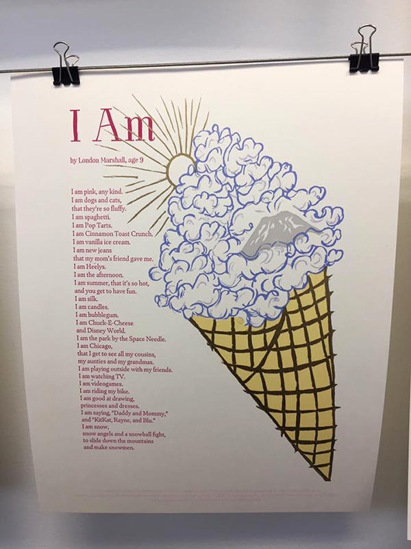
Sukhie Patel I love carving linoleum and engraving wood, so I knew I wanted to draw and then hand-carve the poem’s illustrations. Carving is, for me, a form of meditation, and it was a beautiful way to contemplate this young poet’s life and honor her through that process. It was hard to narrow down what to illustrate, as the poem had so many vibrant images to choose from. I wanted the broadside to capture as much of the visual levity and sweetness of the poem as possible, so I chose to carve this metallic gold ice cream cone of whimsical pastel cotton-candy-esque clouds, with Mount Rainier popping out amidst them. It ended up being 6 separate blocks, and including text, 8 passes.

Sukhie Patel letterpress prints for the 2017 SVC Children's Broadsides.

I found out two days after receiving the poem that the lovely young poet, London Marshall, had passed away at age 9. My approach thus shifted from designing a broadside to delight a 9-year-old audience, to designing a commemorative broadside for her family. I wanted to create something the family would want to return to at different stages in their grieving, that did not preclude a path of healing, and could bring them a smile. I hoped the illustrations would capture the levity of being nine years old, the vivacity of being a young girl, the earnestness of feeling in love with the world around her. It was an honor to print London’s poem, and spend time with her words.

Sukhie Patel letterpress prints for the 2017 SVC Children's Broadsides.

My print consisted of 6 hand carved linoleum blocks and two photopolymer plates. I don’t know how I would have pulled this off without the help of Boxcar. I had never printed with photopolymer before, but with the structure of this poem (each line began with “I am”), I didn’t have any cases of metal type with enough capital I’s! Incorporating photopolymer also allowed me to select a more contemporary and youthful typeface. It was such a pleasure working with Boxcar on this project, and (despite being a sucker for handset type) I can’t wait to incorporate photopolymer in more of my designs. It really did open up my eyes to a whole new set of techniques and approaches.

Stay tuned & read on about this amazing Broadside project in the upcoming Part 2. The ever-inspiring work of both poets and printers and the brilliant results are why Boxcar has a big soft spot for such an amazing tradition year after year.

Printing Community Spirit: Ladies of Letterpress

With the upcoming Ladies of Letterpress conference plus Print Week happening just around the corner (September 28, 2017-October 1, 2017) in St. Louis, Missouri, we catch up with Kseniya Thomas on the Ladies of Letterpress’ excellent camaraderie, fun, and cool happenings (and don’t worry fellas, Ladies of Letterpress is happily open to men as well!). The Ladies of Letterpress conference features more than a dozen workshops, panels, printers’ market, as well as a must-see showing of “Pressing On: The Letterpress Film“.

When Jessica C. White and I started Ladies of Letterpress nearly ten years ago, our goal was pretty simple: make it easier for new printers to figure out what they were doing, and why. It doesn’t seem like that long ago, but it wasn’t easy in the aughts to get good info on how to operate letterpress presses with a minimum of frustration. And the letterpress community was localized and largely offline.

A lot has changed in the ensuing near-decade. Help is readily at hand online no matter what the letterpress problem, Wayzgeese abound coast-to- coast, and our own conference has grown to include workshops, business talks, technical instruction, and more. You never have to print alone, unless you want to! Ladies of Letterpress has grown and changed, and its mission now includes community cultivation, conference planning, trade-show wrangling, group projects . . .

It’s been interesting and rewarding for me to see how letterpress and printing have changed since we started LOLP. Seeing people struggle and succeed in the service of letterpress is inspiring; letterpress isn’t the easiest gig out there, but people fall hard for it and make printing work for them, and keep the art and craft of printing growing and evolving. This evolution inspires me to print my own work when I take a break from my regular jobs.

Though two people started LOLP, many, many people and organizations keep it going with their generosity, enthusiasm, and continued interest. The creative helpfulness of our fellow printers has only increased, and keeps growing as our numbers grow. LOLP represents one thing printers can make when they come together.

Boxcar Press salutes the Ladies of Letterpress and all the other organizations and clubs who are the mentors, tutors, trailblazers, and backbone of the art of letterpress.

www.briarpress.org
www.collegebookart.org
http://printinghistory.org/
http://www.apa-letterpress.com/
www.letterpresscommons.com
http://woodtype.org/
http://vandercookpress.info/
https://listserv.unb.ca
www.penland.org
http://www.thearmnyc.com/
http://www.fpba.com/
http://thebeautyofletterpress.com/
The more than dozen Book Arts Centers across the world

The Art of Printing: Prose, Song, and Poetry to Entertain Those in the Trade

Who doesn’t love a rousing, good ditty, or a clever, snappy poem with a wicked twist of words?  And what better than an ode about your favorite topic – printing – written by and for printers?

We recently found a digital copy of a poetry book about printing from 1833.  Turning the pages makes you feel like you are at a comfortable British pub house a couple of hundred years ago, raising a glass with inky nails, saying, “Have ye heard this one?”

The title of the book is Songs of the Press and Other Poems Relative to the Art of Printing, gathered by T. Kirk, Printer of Nottingham, 1833.  It is available for download at www.openlibrary.org.

One of the gems we found included a curse or censure by a printer who called down mayhem on his colleague.

Printing Prose Song and Poetry: Vintage pressman illustration(illustration courtesy of Briarpress.org)

The Poet’s Anathema by R.S. Coffin

On a printer who had displeased him.
May all your columns fall in pie,
Each chase be gnawed by rust;
Weak, weak as water be your lye,
Your cases filled with dust.
May all your sticks untrue be made,
Your frames too high or low;
No page upon the stone be laid
Where it should rightly go.

Printing Prose Song and Poetry: Book an Job Printers Illustration(illustration courtesy of Briarpress.org)

How about a song on the Origin of Printing by Dodd, in particular, one that praises good printing and the demise of hand-copying.

Aided by thee, the printed page
Conveys instruction to each age;
When in one hour more sheets appear,

Than Scribes could copy in a year.

An anonymous poet captured that moment when a printer gets what he is looking for…

Printing Prose Song and Poetry: Printer's Kiss poem

Print on my lip another kiss.
The picture of thy glowing passion;
Nay, this won’t do— nor this — nor this —
But now — Ay, that’s a proof impression!

One more thought to give some perspective on what it meant when you held a book in the 1800’s and the nice thought that countless of our fellow fine press printers still handle many of these tasks themselves.

The following twenty-two occupations are engaged to produce a single book (circa 1873):-The author, the designer, the rag merchant, the paper maker, the stationer, the type founder, the press maker, the ink maker, the roller maker, the chase maker, the reader, the compositor, the press­man, the gatherer, the folder, the stitcher, the leather seller, the binder, the coppersmith, the engraver, the copper-plate printer, and the bookseller.

Are you inspired to pen your own sonnet or lyric to printing?  Send us your verse in the comments section below!

In search of the perfect printing ink – why not do it yourself?

Letterpress printers have many tools at their disposal, such as presswash, line gauges and quoins. Not the least of these is their favored printing ink. Broach this subject with a group of printers in person or an online forum and most can hotly debate the one they can’t live without.

(photograph courtesy of coloranthistory.org. Those interested in purchasing a 13″x19″ archival poster print can reach out to Andy here. )

Yes, we are going to step into that debate and ask specifically which black printing ink do you hold in high esteem but before we do that, we want to entertain you with an article from a book that gives the recipe for making your own.  Looks pretty simple to us but you decide.

The sage instructions of experience come from this book found on openlibrary.org

Six Hundred Receipts, Worth Their Weight in Gold by John Marquardt of Lebanon, PA.

Turn to page 75 – Receipt No. 138  How to make Black Printer’s Ink.

“Printers’ ink is a real black paint, composed of lampblack and linseed-oil, which has undergone a degree of heat superior to that of common drying oils. The manner of preparing it is extremely simple. Boil the linseed-oil in a large iron pot for 8 hours, adding to it bits of toasted bread the purpose of absorbing the water contained in the oil; let it rest till the following morning, and then expose it to the same degree of heat for 8 hours more, or till it has acquired the consistence required; then add lamp-black worked up with a mixture of oil of turpentine and turpentine.

The consistence depends on the degree of heat given to the oil, and the quantity of lampblack mixed up with it; and this consistence is regulated by the strength of the paper for which the ink is intended.

The preparations of printers’ ink should take place in the open air, to prevent the bad effects arising from the vapor of the burnt oil, and, in particular, to guard against accident by fire.”

If one receipt isn’t enough, another is available on page 264 , No. 597  An Excellent Printing-Ink.

Balsam of copaiva, (or Canada balsam,) 9 ounces; lampblack, 3 ounces; indigo and Prussian blue, each 5 drachms; Indian red, 3/4 ounce; yellow soap, (dry,) 3 ounce. Grind it to an impalpable smoothness. Mix with old linseed oil. “

In case you are wondering – the drachms is a unit of weight formerly used by apothecaries, equivalent to 60 grains or one eighth of an ounce.

Letterpress printers, as a group, seem to be interested in trying new things for their art, so we hope that these two recipes might get a try-out or two from someone.  However, it is also fun to note that within the 598 other receipts in this book, you can also find a recipe for peppermint cordial, a cure for the bite of a mad dog, and treatment for scabby heads on children and toothaches.  

Back to our original question, we truly are interested in hearing about your favorite black printing ink, either ones you have used in the past and can’t find anymore or one you use everyday.

Tell us in the comments below!

Margery Cantor: On Why I Love Letterpress

I first learned about letterpress at the West Coast Print Center, where I was employed working in the camera department. There was a Vandercook Proof Press and Joanna Drucker was printing a book. I was enchanted and watched closely, the process seemed both logical and magical. Sometime after I left the Print Center I began to work for Adrian Wilson and that is when I really fell for the craft. What was it, the smells; the texture of papers; the rhythm quiet, thoughtful and methodical; the mastery of a machine that changed history? And then to see that all the patience and attention gives way to page; a broadside; a book that is simply beautiful to hold and to read. Why do I love letterpress, I think because the craft encourages the practitioner to give oneself over to the process and that giving over shows a willingness to try for perfection, again and again.

Margery Cantor has designed books for many presses in California, such as the Stanford University Press and the University of California Press.  She is currently at The Impermanent Press in Norwich, Vermont and is still printing.  A recent work is the letterpress version of Illustrated by Lynd Ward: From the Collection of Robert Dance (The Grolier Club).

Passionate about printing? Head-over-heels for letterpress? Let us know why you are love with letterpress in the comments below!

Let’s See That Printed: Bryan Baker’s Hypnotic Print

A myriad of eye-catching and pop-culture surreal characters snagged our attention when printer Bryan Baker and artist Jasper Wong’s fun order passed through our custom-made photopolymer platemaking service department. So much that we couldn’t resist the urge to reach out and get the scoop on such a brilliant and wild project!

The ever-wonderful Bryan helped illuminate how such an bright, hypnotic printing project came to be.

This project was printed at Striped Light in Knoxville Tennessee, by Bryan Baker. The artist who did the design is Jasper Wong. It is the second time that Striped Light made an edition of his work through an ongoing collaboration with a Detroit publishing company called 1xRun.  

This particular piece was printed to coincide with a rather large street art event call “Pow Pow” in Hawaii. The print was run in four color ways: Trans on Pink, Trans on Teal, Black on Black, and Green and Black on Teal.  All finished with hand torn edges.

Striped Light is often commissioned by 1xRun to do limited edition letterpress prints for the artists that they represent. It it a pretty exciting relationship, because they work with artists from all over the world, and are now in their fourth year of working together. It first began while Bryan was up in Detroit running a shop called Stukenborg Press, and has continued with his new community letterpress shop that he opened with his partners Sarah Shebaro, and Jason Boardman.

On My Own Time Art Gallery Exhibition at Boxcar Press

By day, the majority of our staff here at Boxcar Press is surrounded by creativity during their workdays— whether it’s designing and illustrating invitations and stationery, or putting ink to paper and printing heirloom pieces. When it comes to their downtime, though, many of our employees have artistic skills beyond the world of letterpress. We had the pleasure of getting to see some of the art from our employees through an exhibition as part of the On My Own Time program through CNY Arts — in total, we had 21 pieces on display from six artists on our staff. Three of the pieces were selected to go on to the larger On My Own Time exhibit that will take place at the Everson Museum in Syracuse this fall. Here’s a peek at our gallery!

The 2017 On My Own Time Boxcar Press art gallery exhibit

The 2017 Boxcar Press On My Own Time Exhibit

The 2017 On My Own Time Boxcar Press art gallery exhibit

Artist: Jennifer DeRoberts

The 2017 On My Own Time Boxcar Press art gallery exhibit

Artist: Jennifer DeRoberts

The 2017 On My Own Time Boxcar Press art gallery exhibit

Artist: Madeline Bartley

The 2017 On My Own Time Boxcar Press art gallery exhibit

Artist: Madeline Bartley

The 2017 On My Own Time Boxcar Press art gallery exhibit

Artist: Clayton Estey

The 2017 On My Own Time Boxcar Press art gallery exhibit

Artist: Rebecca Miller

The 2017 On My Own Time Boxcar Press art gallery exhibit

Artist: Carrie Valenzuela

The 2017 On My Own Time Boxcar Press art gallery exhibit

Artist: Carrie Valenzuela

The 2017 On My Own Time Boxcar Press art gallery exhibit

Artist: Carrie Valenzuela

The 2017 On My Own Time Boxcar Press art gallery exhibit

Artist: Thomas Abbamont

Clean Prints at Spotty Boy Press

Molly Kempson of Spotty Boy Press wears many creative hats and has a knack for inspiring those around her. From making art (and joy!) with a local research hospital’s patients to working full time as an elementary art teacher, there is never a dull moment. The recent Coffey resident book artist (University of Florida) and Hamilton Wood Type’s New Impressions exhibitionist sat down with us to talk shop about life’s inspirations (from patients she has worked with to working with her local artist studio collective), exploring the 21,000 acre wildlife preserve mere minutes from her studio, and the Eureka! moment of when she used a linoleum block in her press for the first time.

Molly Kempson of Spotty Boy Press (Floriday) serves up fresh prints and good cheer.

ADVOCATE FOR THE ARTS I’m an elementary art teacher and I make art with patients in my city’s research hospital as an artist-in-residence. I learn so much from teaching and take it to the studio with me. I’m pretty awful at science, but I like to think that I missed my chance as an understudy for Audubon and Bartram – I am obsessed with creatures.

Molly Kempson of Spotty Boy Press (Floriday) serves up fresh prints and good cheer.

LOVE AT FIRST SIGHT I finished my M.A. in art education at the University of Florida last spring (2016). I pursued that degree with ambition for both becoming a better art teacher and to work alongside MFA printmaking students. I had been making linocuts for years, and took a class in intaglio and spent a miserable semester on the same plate – I couldn’t just leave it alone. I decided to take letterpress the next semester with Ellen Knudson, whose work I already loved. It clicked right away, and when I found out I could put linoleum blocks in the press it was all over.

   Molly Kempson of Spotty Boy Press (Floriday) serves up fresh prints and good cheer. Inking up a C&P with Molly Kempson.

PRINTING COLLECTIVE I print in a collective of artist studios in Gainesville, Florida. Some folks are faculty or alumni of the University of Florida, and many aren’t – we’re a small town with a vibrant arts community outside of the university. Each studio is separate, but I love opening my door and connecting with the 19 other artists in my space.

It’s my personal gallery of prints from friends. Trading with other multiple-makers (ceramicists as well as printmakers) has provided me with a space that is just buzzing with colors and details that want to keep me moving forward.

https://vimeo.com/185829023

FAB IN FLORIDA North Central Florida is full of springs, bright blue pools of water in the forests where manatees warm up in winter and alligators stay scarce. Being able to kayak in clear fresh water all year is something people don’t associate with Florida. I spend most weekends on the water without making it to the beach, which baffles some people.

Molly Kempson of Spotty Boy Press (Floriday) serves up fresh prints and good cheer.

Gainesville has a ton of parks in city limits, too. I can bike to a 21,000-acre preserve full of sandhill cranes, bison, wild horses, and massive gators from my studio within fifteen minutes.

Molly Kempson of Spotty Boy Press (Floriday) serves up fresh prints and good cheer.

PRINTING MENTORS Ellen Knudson (Crooked Letter Press) taught me impeccable studio manners and problem-solving skills. Martin Mazorra taught me at Penland and helped me work through ideas faster using negative space more effectively. Sarah Shebaro (Striped Light) showed me what linocut letterpress can look like in a style that riffs off of modern quilting. It’s amazing.

I am always entranced with Jennifer Farrell‘s ingenious typesetting and her ampersand series. 

Ashley Taylor is a Florida printer constantly changing and mixing print mediums with intention and perfectly honed craft. She’s as comfortable making wood veneer letterpress matrices with Eileen Wallace as she is mixing day-glo puffy screenprinting over traditional etchings.

PART TIME PRINTING, FULL TIME FUN I don’t print full-time. I would say 40% of my “work” time is spent printmaking, the rest teaching in my school and hospital. My work is reciprocal – I make work inspired by the people with whom I work. If it’s a kindergartener’s drawing of a snake she saw (or imagined) or my experience making a portrait of a patient/wildlife rehabilitator’s fox, it’s working material. I take it to the studio with me. My students and co-collaborators fuel my practice completely.

PRINTING FEATS Last summer (2016) I was the Coffey resident book artist at the University of Florida’s special collections. I was able to continue working with Ellen Knudson, who did nearly all of the binding and most of the typography (I can carve all day, but I don’t consider myself a designer). Working with the natural history collections in UF’s special collections, I created a print portfolio of all of Florida’s woodpeckers with three-color reduction prints of each bird. We made an edition of fifty artist’s books of eight prints each in portfolio cases.

I was recently selected for the New Impressions exhibition at the Hamilton Wood Type and Printing Museum along with some serious print heroes.

PRESS HISTORY  My current press was actually my very first press! It’s a C&P 8×12, and I love it. I can’t print the big stuff I’m used to, but I’m adjusting. I have been carving linocuts in the chase and my reduction prints have never been better!

I’m a teacher of small children and used to planning for the worst case scenario. Planning for a press move took months for me, and I was blessed with a wonderful seller (a great stationery printer in his own right – Matthew Wengard) and very enthusiastic & almost dangerously cavalier movers. If you’re a control freak, my only advice for a press move is to surround yourself with optimists experienced in moving heavy things.

Chandler & Price (Florida).

BOXCAR’S ROLE Boxcar lets me focus on my strengths – linocut and woodcut carving – while producing high-quality plates for book arts and stationery purposes. My artist’s book (the Woodpeckers of Florida) was printed and bound in eight weeks and wouldn’t have been possible without photopolymer plates – this project required 2400 passes through the press, leaving no time to set or distribute type.

SHOP TIPS For platen press relief printers, carve in your chase! And for you reduction block printers on proof presses, watch and make notes on those quoins. Ghosts can haunt your registration, and no matter how neurotic you are, cut more paper than you will ever need for a reduction print.

WHAT’S NEXT Another book arts project on North Florida vernacular language for plants, animals, and buildings is in the works.

A huge round of applause out to Molly of Spotty Boy Press and we’re excited to see what new book arts & printing adventures she’ll be embarking on soon!

Letterpress Art Prints for Obvious State’s Kickstarter Campaign

Obvious State is a New York City-based creative studio and literary brand meant to inspire through their art prints, tote bags, and other items for bibliophiles, word lovers, and art lovers alike. We recently partnered with Evan at Obvious State to create these large, 11″ x 14″ letterpress prints featuring their “Martini” artwork, in black ink on our Heidelberg Cylinder Press. The prints are available for sale (along with 11 other styles that we’ll be letterpress printing, too!) now through June 8th as part of their current Kickstarter campaign. Learn more and get yours today!

Letterpress art prints from Boxcar Press

Letterpress art prints from Boxcar Press

Letterpress art prints from Boxcar Press